Approved

Moderator
M
Moderator
01:13, 11th May 2016
~Nightmare:

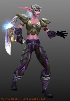
All desired changes were made. The shading is well done. The face is gorgeous and armor is kickass even though it is so simple. But needs one more color to give a nice atmosphere. But it's fine.

Just a extremely useful simple skin. Although next time you may want to add extra detail to your future skins. Good job btw.

~Nightmare:
All desired changes were made. The shading is well done. The face is gorgeous and armor is kickass even though it is so simple. But needs one more color to give a nice atmosphere. But it's fine.
Just a extremely useful simple skin. Although next time you may want to add extra detail to your future skins. Good job btw.

")