-
Listen to a special audio message from Bill Roper to the Hive Workshop community (Bill is a former Vice President of Blizzard Entertainment, Producer, Designer, Musician, Voice Actor) 🔗Click here to hear his message!
-
Read Evilhog's interview with Gregory Alper, the original composer of the music for WarCraft: Orcs & Humans 🔗Click here to read the full interview.
-
🏆 HD Modeling Contest #7 POLL is live! ✅ Vote for the TOP 3 MODELS! ❗️Poll closes April 28, 2025. 🎬Watch the entries on our YouTube channel! 🔗 Click here to cast your vote!
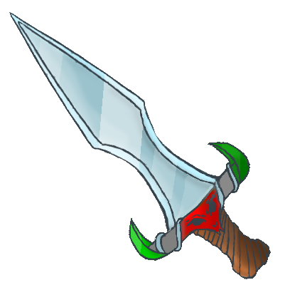
Serpent Sword

- Author(s)
- Uyarrr
- Size
- 12.3 KB
- Rating
- Downloads
- 164
- Created
- Jul 15, 2019
- Updated
- Jul 15, 2019
- Resources
- 1
- State
 Approved
This bundle is marked as recommended. It works and satisfies the submission rules.

My first try! Please feel free to drop feedback. It's probably not fitting wc3 at all but you know its still item!
Previews


Reviews


