-
Listen to a special audio message from Bill Roper to the Hive Workshop community (Bill is a former Vice President of Blizzard Entertainment, Producer, Designer, Musician, Voice Actor) 🔗Click here to hear his message!
-
Read Evilhog's interview with Gregory Alper, the original composer of the music for WarCraft: Orcs & Humans 🔗Click here to read the full interview.
-
Create a faction for Warcraft 3 and enter Hive's 19th Techtree Contest: Co-Op Commanders! Click here to enter!
-
Get your art tools and paintbrushes ready and enter Hive's 34th Texturing Contest: Void! Click here to enter!
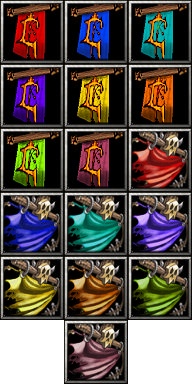
Recolored HumanFlag&HordeFlag
 HumanFlag

 HordeFlag

Contents


 Pending


