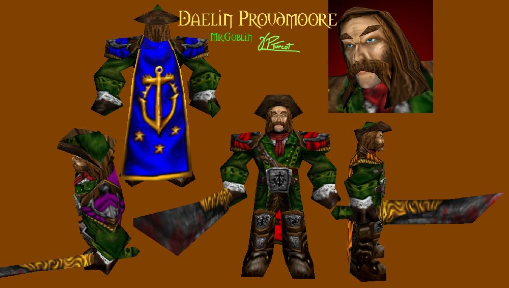
It looks awesome. But, I hope you wouldn't mind for some constructive and friendly criticism, maybe you can improve your skin like this.
So first of all, the color of his clothes. Being an Admiral(leader of a navy, you know

), green clothes just don't suit him that well. His clothes make him look like some forest ranger or something. I'd recommend black shiny leather instead, or blue(definitely the most fitting color for naval-based characters), or even perhaps red. On a side note, I'm really glad you got the Kul Tiras symbol right.
Then there's the whole filter\stock image you seem to be using for clothes... It make it look very ugly in my opinion, gets quite repetitive after a while. I mean those small lines, meant probably to represent the treads.
The metal on his blade and armor also looks very... Rusty, old, something Orcs would use but not Humans. I'd recommend a much, MUCH more shiny look to all the metal on him, with much higher brightness and highlights, kind of like
this. As in, instead of rusty iron, try using stainless steel. This also means getting rid of those little "Scratches". Try to do what you do with gold, but in a more light-gray\silver color.
And then, the biggest and most important problem in my opinion... The hair. It looks bad. I know you can do much better than this and I saw you do much better than this. The hair just looks disgusting when it's wrapped on the model, no offense. The dark brown "holes" between each strand of hair are the main problem, they look ugly and when wrapped on the model they seem out of place.
If you try improving those, I can assure you, the skin will look even better than now. And it is completely fucking awesome right now. For now, I'll rate this 4/5.
 Approved