


- Joined
- Nov 2, 2004
- Messages
- 1,993

As always, will add purist version and icons later =)

(4 ratings)
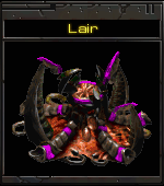
 Approved
|
| 
|


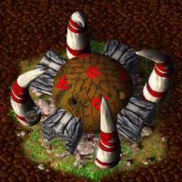
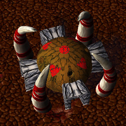
Rewrapped the texture, what do you think? I can't decide if it's better or worselove it, but the textures seem a bit stretched
Well, the original is rotated with its exit to the left, diagonally. It looks more like a sort of Stonehenge and has some red markings (which could be some sort of windows?).@deepstrasz any suggestions to make it more like the original? (still gonna add a "purist" version later, rotated and without the axe/shield things)
I was thinking of replacing the entrance texture with something lighter, but decided not to. What do you think?

I'm actually working on improving the wrapping considerably.


You're right, done.maybe also rotate the wrap on those bone-tooth-pillar-things so it'd look like they all get lighted from the same angle
I have an edited version of the DoC model in my resources thread (link in sig), maybe you'll like that one better?Lookin nice, but i agree, the texture looks bad, i'm pretty sure i've seen a remake of that building some years ago with ingame textures with a better wrapping, but yours is a purist version so i think that model couldnt be of any help
I didn't make that model though, just edited it a bit and gave it ingame textures, so I would need permission from the original authorsYeah thats the one! i think you should upload it too! it's pretty good
Thanks!A creative and well made recreation of a wc1 building.
Great details and excellent use of in-game textures.
A bit too high on polygons though.
Works in-game and performs well.
Good job.

