- Joined
- May 24, 2016
- Messages
- 799

I noticed a couple issues and "dents" in Hive's Icon borderizer tool that cause visual issues, rough edges and unnecessary loss of the original art when generating HD icons with Hive's built-in Icon Borderizer.
In this thread I'll be trying my best to explain my experiences with it and how the tool could be optimized via minor tweaks and adjustments.
And as someone who has uploaded over 40 bundles of HD Icons alone and probably well over 300 individual HD icons at this point, I'd say I'm fairly well experienced on the subject.
Issue #1 - Loss of Art
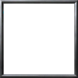
Let's say this is your icon, but theres a lot of cool detail around the edges of your fine art.
Sadly, the Hive icon borderizer just cuts off the outer egde of your fine art by putting the icon border over it.


Left: Full 256x256 art
Middle: Hive Borderizer BTN output
Right: Art downscaled to 232x232, then borderized (keeps 100% of the detail, 0 pixels lost)
I see two possible solutions to this that would work equally well.
1. Make the Borderizer compatible with 232x232 pixel image imputs, this way no pixels of your art are lost. (for those who want to crop/adjust scale manually)
2. Make the borderizer itself able to downscale the inserted art from 256x256 to 232x232 by adding a clickable optional checkbox before the borderizing process.
However, do make it optional, not forced. Check issue #3 for clarification.
Issue #2 - Rough edges, bad transitions
When inserting an icon that's 232x232 pixels, already has an BTN Icon rim or otherwise a solid black rim, the Icon Borderizer will create rough edges when yielding a passive icon.
Couple examples: (Solid white image used to best visualize the issue)
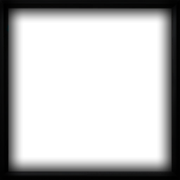
(left image is inserted into the borderizer)
As you can see, the generated passive has its gradual black transition, but it's impeded by this solid black rim. This results in a very rough, "forced" edge that doesn't look very natural and is quite an eye-soar on brighter icons. Even worse: part of the BTN border is still visible through the black rim!

In my opinion, a very easy way to fix this is to universally (no exceptions) replace all space outside of the 232x232 pixel center with solid black and add a 5 pixel soft shadow on the inside of it for all future PAS and DIS format icons. (ONLY FOR PAS AND DIS)
Here's a little side by side example of the solid white icon again to show you what this accomplishes:


Input image to the left, space outside of 232x232 is pure black with a 5 pixel soft shadow.
Middle image is the resulting PASBTN, its a much smoother and universally natural transition. (doesnt matter if the art is dark or light, it'll always be natural and smooth)
Right image is the result when inserting just an untreated white square (notice the ugly unnatural transition and solid black rim)
However, ONLY make it apply this with PAS and DIS format icons!
Because if you apply the black rim + shadow on every icon format, the resulting BTN will turn out like this:

(forces an unneeded shadow on the inside of the BTN rim which doesn't need to be there)
#3 Auto-cast Icons
Currently in reforged Auto-cast icons have full art without any black rims or borders.
Example:
Notice how at the top, left and bottom of the icon, the art is full and doesnt have any kind of border whatsoever.
This is where my point from issue #1 plays into. The optional checkmark that users would be able to click before borderizing their icon clarifies whether their icon is a full 256x256 pixel art, or a 232x232 pixel with already has existing borders, so it's clear to the Borderizer and it knows what optimizations to apply.
If this checkbox is selected (so the borderizer knows its full art):
1. The art should be downscaled to 232x232 for the BTN, PAS and all DIS formats. (everything except Auto-cast)
2. For the PAS and all DIS icons: the rim + shadow effect should be applied
3. The full unfiltered 256x256 art should be used for the Auto-cast icons
Currently the hive Borderizer forces a black rim around the Auto-cast format icons, which isnt consistent with the Auto-cast icons found in Reforged.
(Solid pure white image input)

(it doesnt need the black rim nor shadow)
When the checkbox isnt selected or a 232x232 pixel image is uploaded, it goes into the BTN raw, PAS and all DIS still gets the 5px shadow and this 5px shadow is also applied to the Auto-cast (see example below)

Raw image input result (left)
5px shadow rim input (right)
Universally smoother and natural.
There, I've done my absolute best in trying to explain and visualize it. I hope you understand the points im trying to tell.
In this thread I'll be trying my best to explain my experiences with it and how the tool could be optimized via minor tweaks and adjustments.
And as someone who has uploaded over 40 bundles of HD Icons alone and probably well over 300 individual HD icons at this point, I'd say I'm fairly well experienced on the subject.
Issue #1 - Loss of Art
Let's say this is your icon, but theres a lot of cool detail around the edges of your fine art.
Sadly, the Hive icon borderizer just cuts off the outer egde of your fine art by putting the icon border over it.
Left: Full 256x256 art
Middle: Hive Borderizer BTN output
Right: Art downscaled to 232x232, then borderized (keeps 100% of the detail, 0 pixels lost)
I see two possible solutions to this that would work equally well.
1. Make the Borderizer compatible with 232x232 pixel image imputs, this way no pixels of your art are lost. (for those who want to crop/adjust scale manually)
2. Make the borderizer itself able to downscale the inserted art from 256x256 to 232x232 by adding a clickable optional checkbox before the borderizing process.
However, do make it optional, not forced. Check issue #3 for clarification.
Issue #2 - Rough edges, bad transitions
When inserting an icon that's 232x232 pixels, already has an BTN Icon rim or otherwise a solid black rim, the Icon Borderizer will create rough edges when yielding a passive icon.
Couple examples: (Solid white image used to best visualize the issue)
(left image is inserted into the borderizer)
As you can see, the generated passive has its gradual black transition, but it's impeded by this solid black rim. This results in a very rough, "forced" edge that doesn't look very natural and is quite an eye-soar on brighter icons. Even worse: part of the BTN border is still visible through the black rim!
In my opinion, a very easy way to fix this is to universally (no exceptions) replace all space outside of the 232x232 pixel center with solid black and add a 5 pixel soft shadow on the inside of it for all future PAS and DIS format icons. (ONLY FOR PAS AND DIS)
Here's a little side by side example of the solid white icon again to show you what this accomplishes:
Input image to the left, space outside of 232x232 is pure black with a 5 pixel soft shadow.
Middle image is the resulting PASBTN, its a much smoother and universally natural transition. (doesnt matter if the art is dark or light, it'll always be natural and smooth)
Right image is the result when inserting just an untreated white square (notice the ugly unnatural transition and solid black rim)
However, ONLY make it apply this with PAS and DIS format icons!
Because if you apply the black rim + shadow on every icon format, the resulting BTN will turn out like this:
(forces an unneeded shadow on the inside of the BTN rim which doesn't need to be there)
#3 Auto-cast Icons
Currently in reforged Auto-cast icons have full art without any black rims or borders.
Example:
Notice how at the top, left and bottom of the icon, the art is full and doesnt have any kind of border whatsoever.
This is where my point from issue #1 plays into. The optional checkmark that users would be able to click before borderizing their icon clarifies whether their icon is a full 256x256 pixel art, or a 232x232 pixel with already has existing borders, so it's clear to the Borderizer and it knows what optimizations to apply.
If this checkbox is selected (so the borderizer knows its full art):
1. The art should be downscaled to 232x232 for the BTN, PAS and all DIS formats. (everything except Auto-cast)
2. For the PAS and all DIS icons: the rim + shadow effect should be applied
3. The full unfiltered 256x256 art should be used for the Auto-cast icons
Currently the hive Borderizer forces a black rim around the Auto-cast format icons, which isnt consistent with the Auto-cast icons found in Reforged.
(Solid pure white image input)
(it doesnt need the black rim nor shadow)
When the checkbox isnt selected or a 232x232 pixel image is uploaded, it goes into the BTN raw, PAS and all DIS still gets the 5px shadow and this 5px shadow is also applied to the Auto-cast (see example below)
Raw image input result (left)
5px shadow rim input (right)
Universally smoother and natural.
There, I've done my absolute best in trying to explain and visualize it. I hope you understand the points im trying to tell.
Last edited:


