Moderator
M
Moderator
Vengeancekael 
Date: 2013/Jan/29 19:05:31
Comment:
[tr]
 Rules
Rules
17:47, 21st Mar 2012
Vengeancekael: Hurr - Approved

Date: 2013/Jan/29 19:05:31
Comment:
Sigh... Updated & upped the rating.
| Highly Recommended |

Vengeancekael 
Date: 2012/Nov/02 00:40:35
Comment:
[tr]
 Rules
Rules

Date: 2012/Nov/02 00:40:35
Comment:
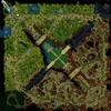
Terrain-wise there's not much to say, everything's detailed, the tile variation is well executed and it looks realistic.
Gameplay-wise, it's the classic AoS style with 3 spells and an ultimate, while you've also included a combo system, which is kind of fun to fiddle around with.
The elements system is a small addition, but I don't see it as gameplay style changing.
You've added 2 different boss scenarios with varied spells for the bosses which is a neat idea for an AoS map, but you went too far with RPG elements in OaD: The quests you've added aren't necessary, you're deriving the game too much into the wrong direction, players should focus on PvP and on lanes.
There's a large variety of items, you've organized them well with the single merchant.
The custom units and models however are kind of a let-down due to the low quality, I know you're supposed to make low quality textures because of the file size limit, but this is just really bad to look at. :V
It would've been better to use models from the models section which are of high quality while at a small file size.
The Cosmic Mage's model/skin is a great example for this: The black cape is just really unattractive and not majestic looking at all, it looks like as if it's made of some black dirt. You've also made his eyebrows gray-white which doesn't really match the rest of his face, black would have been wiser.
And he looks weird with just one shoulderpad.
The Desert Mage's attack animation is also choppy looking, he always moves his legs awkwardly after every attack.
But enough of these small details, lets just get straight to the final point:
You've stuck to close to the generic AoS style, 3 lanes, creeps in a jungle, bosses (yours with different spells), a main building you have to destroy (but you have added a domination mode which is basically capturing 2 points to score - This is however a mode that is rather a small feature that will not be played so often, the normal mode is the main and more complex mode.
When I approved the project as a hosted project, I was expecting your team to come up with something completely out of the box, however you've leaned too much towards the classic AoS and only done retouches, by improving upon the same idea.
A video game comparison would be Rift and WoW, Rift being mainly the same type of game as WoW, but just having improved upon the same idea, the same questing system polished, better visuals, etc.
Note: I totally forgot to mention the UI, yeah I guess it's fine to implement DISBTN's like that to save space.
So to close this off, I will rate this 4/5, but will raise the rating once you've done the below things:
- 80% of the hero selection info is the storyline of the hero which, to be honest, 90% of players don't care about. I had already told you to add a short summary of the hero's skills and main function. in the team.
- Oasis Archer's+Desert Spearthrower's shadow image should be shrunk
- The level indicator should be put behind the player's name in the multiboard, to save space. (and it'd look better) [Talking about the multiboard here]
- Reduce the size of the Oasis Defender's selection circle
| Recommended |

17:47, 21st Mar 2012
Vengeancekael: Hurr - Approved


 Approved


