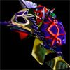
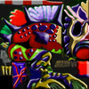
No.. hehe, not less color, just not so bright.. and a bit more saturated

less color --> less opacity --> transparent TLI Inferno, but I know what you meant to say

Now, in a skin you need much contrast. But not contrast in colors, just in color "power?" (very dark to very light)
Cuz color contrast is too Shouting, it takes all your attention and disturbs your eyes. What you need to do is make a skin with different colors but close ones, and not so Hue-Saturated (+) - for exampl: orange matches with red and yellow, blue with green and purple, BUT purple doesn't match with green - at least not that cool, so if you're gonna make a blue creature - choose only 1 of the colors close to it and make variations - Blue-Green 0 255 255 (RGB), Blue-Green 0 150 255, Blue-Green 0 255 150 etc.
And try to avoid color contrast like red-blue, green-purple, etc. You can use them but not too much. Red-blue is really good when you want to "center" the attention of the one looking at your image - for example, 2 mages with Brown robes and a bit saturated, gray, casting a fire and an ice spell to each other - your attention goes right to the Red-Blue mess in the middle, you focus the eye of the viewer to the place you want it to be... but that is only for pictures. In skins it is good to avoid this "attention taking trick" and make everything a bit saturated and dead, yet, still not saturated as the environment around it. Actually, the whole skin is your Attention Spot. Not a part of it. All of it. And it STILL shouldn't be too eye -catching. If you're gonna use red for example, don't use (red green blue) 255 0 0. Use 160 0 0. And use like 255 0 0 red on the places where the light hits the skin/metal/whatever you are painting. And when you make such "light effect" stuff use 255 120 120, to make it go more to white and less to red. Also - when you darken some areas, like the inner side of the skin of his hand (which falls under shadow) don't use (red example color) 50 0 0, make it 30 30 30, to get more to gray and black. Etc.


 Approved


