 Approved
Moderator
M
Moderator
15:15, 5th Aug 2009
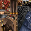
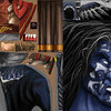
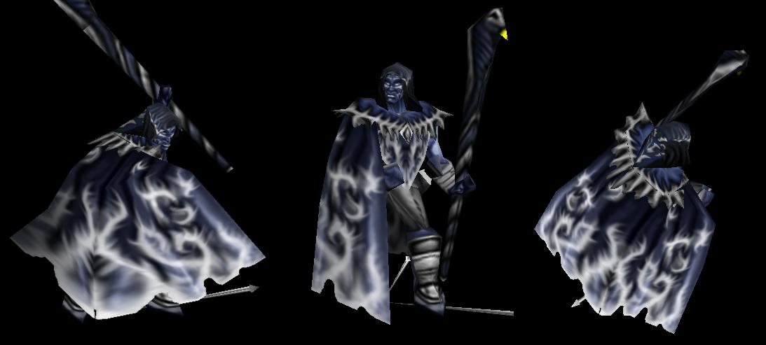
67chrome: Looks cool, but still needs more work. I averaged your freehanding estimates and came up with 50%, so I guess that does put you 1% away from "mostly recolor"
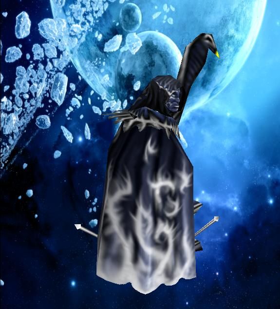
Of course, the amount of original skin showing through is still a little to much to get an approved status. This skin is also very monochromatic, even the gums are the same shade of blue as everything else. The flames on the cape are also a little blurry to, so you have a few things you need to change. This skin has potential to be approved, you just need to work on it a little more
2:26, 28th Aug 2009
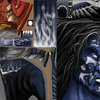
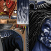
67chrome: Still very monochromatic, their could stand to be a differentiation between the skin tone, armor, and clothing. Right now everything is the same color. The flames on the cape are still a little blurry, maybe create them on a separate layer that allows you to adjust the cape beneath them to make them stand out more.
67chrome: Looks cool, but still needs more work. I averaged your freehanding estimates and came up with 50%, so I guess that does put you 1% away from "mostly recolor"
Of course, the amount of original skin showing through is still a little to much to get an approved status. This skin is also very monochromatic, even the gums are the same shade of blue as everything else. The flames on the cape are also a little blurry to, so you have a few things you need to change. This skin has potential to be approved, you just need to work on it a little more
2:26, 28th Aug 2009
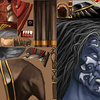
67chrome: Still very monochromatic, their could stand to be a differentiation between the skin tone, armor, and clothing. Right now everything is the same color. The flames on the cape are still a little blurry, maybe create them on a separate layer that allows you to adjust the cape beneath them to make them stand out more.