Listen to a special audio message from Bill Roper to the Hive Workshop community (Bill is a former Vice President of Blizzard Entertainment, Producer, Designer, Musician, Voice Actor) 🔗Click here to hear his message!
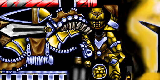
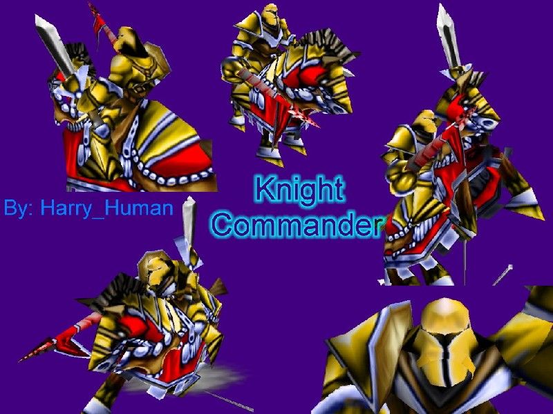
The Knight Commander was one of my better skins... it may not be what people are looking for but if anyone has suggestions to help fix it up please reply. I could never have made it as good as it is without the help of Eerie_Elf.
I think it's too yellow. If it was supposed to look golden, you have to use a darker color between orange and green as basic color, not yellow.
And the helmet has too much black. It should be alphaed or colored, but black alone doesn't look good... :?
spear is crooked and does not look good. Also, the icon is not very good. I like the helmet though, and besides the spear and icon, its an ok skin. 3/5
Alright, I'm new to posting here but I've been looking at these skins pretty often...I've noticed people seldom post Paths, and I can't use the .blp image alone. Is there some shortcut to using a path? Or could someone post the path for this image?
Alright, I'm new to posting here but I've been looking at these skins pretty often...I've noticed people seldom post Paths, and I can't use the .blp image alone. Is there some shortcut to using a path? Or could someone post the path for this image?
This site uses cookies to help personalise content, tailor your experience and to keep you logged in if you register.
By continuing to use this site, you are consenting to our use of cookies.

 Approved

