• Listen to a special audio message from Bill Roper to the Hive Workshop community (Bill is a former Vice President of Blizzard Entertainment, Producer, Designer, Musician, Voice Actor) 🔗Click here to hear his message!
  • Read Evilhog's interview with Gregory Alper, the original composer of the music for WarCraft: Orcs & Humans 🔗Click here to read the full interview.

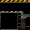
HumanUITile01.blp

This bundle is marked as useful / simple. Simplicity is bliss, low effort and/or may contain minor bugs.
  • Like
Reactions: Dekarchos and ndh
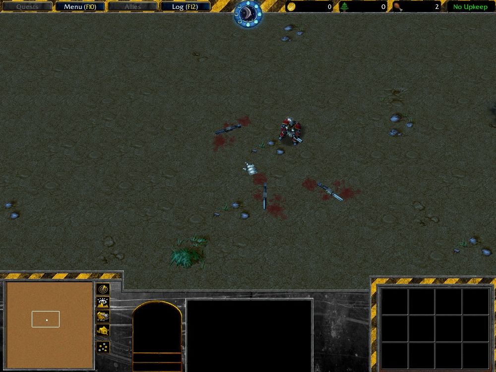
A modern user interface.

Used free art I found online and Photoshop.

The empty space is to put your logo (example below with my C&C map)

GIVE CREDITS IF YOU USE AND + REP ME!!!

2itg8zl.jpg


Keywords:
User Interface, UI, warning, modern warfare, futuristic
Contents

Warning UI (Texture)

Reviews
09:40, 5th Jul 2012 M0rbid: http://www.hiveworkshop.com/forums/2164131-post10.html This and also I feel that you should have used more work to complement the Button positions with your UI. Right now it looks like the buttons somehow are simply put...

Moderator

M

Moderator

09:40, 5th Jul 2012
M0rbid: http://www.hiveworkshop.com/forums/2164131-post10.html
This and also I feel that you should have used more work to complement the Button positions with your UI. Right now it looks like the buttons somehow are simply put onto your skin without them fitting it. Rejected until updated.
 
Level 11
Joined
Feb 23, 2009
Messages
577
Here are all the paths:

UI\Console\Human\HumanUITile01.blp
UI\Console\Human\HumanUITile02.blp
UI\Console\Human\HumanUITile03.blp
UI\Console\Human\HumanUITile04.TGA
UI\Console\Human\HumanUITile-InventoryCover.blp
UI\Console\Human\HumanUITile-TimeIndicatorFrame.blp

UI #4 is weird to import (always is)! Here are the instructions!

The UI #4 MUST be a TGA file! And therefore to work you must:

-Go to Advanced -> Game Interface -> Image - Console Texture 4

Now set Console Texture 4 to: UI\Console\Human\HumanUITile04.TGA

DONE!

FIXED UI #2 (That ugly line on the portrait)
 

Attachments

  • HumanUITile01.blp
    147.5 KB · Views: 179
  • HumanUITile03.blp
    159.4 KB · Views: 158
  • HumanUITile04.tga
    128 KB · Views: 189
  • HumanUITile-InventoryCover.blp
    63.5 KB · Views: 151
  • HumanUITile-TimeIndicatorFrame.blp
    31 KB · Views: 147
  • HumanUITile02.blp
    111.8 KB · Views: 121
Last edited by a moderator:
Level 19
Joined
Aug 8, 2007
Messages
2,765
Sorry it must be 75% freehand and you used those textures a TON, so this is gonna get rejected for too much cut and paste.
 
Level 38
Joined
Jan 10, 2009
Messages
854
I'm not sure were I stand on approving this, It is almost entirely CnP stuff but put together pretty well. The Unit Portrait area seems a little unfitting compared to the rest though, what with the curved arch while everything else is super straight. Would be nice to see some free-handed elements in here, you should also credit other peoples resources whenever possible, even if they are free to use public ones.
 
Level 11
Joined
Feb 23, 2009
Messages
577
Yeah I used anonymous art ;D (on purpose). It's not even art really just 2 pictures that they call "textures" (very nice pics for this tho).

As for free hand I would love to but I am quite new at all this and don't think I would do a good job, and for the Hero Portrait I will do a square version next week to see if it's better.
 
Level 26
Joined
Jun 5, 2008
Messages
1,768
Sorry it must be 75% freehand and you used those textures a TON, so this is gonna get rejected for too much cut and paste.

Actually 75% freehand is for icons and regular skins, isn't it? My only real issue is with this, is that the work look rushed. It needs way more work.
CNP in itself isn't that bad if you properly rework the thing so that it doesn't look like it is, although you have to point out that it is CNP for the sake of a fair judgement.

But yeah, work with this a lot more. It has potential, but like I've said multiple times already, it needs a ton of work.
Then again, the approval of the UI's that I'm thinking about may have been exceptions. Anyhow, good luck.
 
Level 11
Joined
Feb 23, 2009
Messages
577
It wasn't rushed, just my 1st UI lol :)... Took me a day to make, and then someone said I should upload it cause it was nice so I did... I probably won't rework it tho I am planning on making a red (NOD) version.

However if anyone wants to "work" on it feel free, just show me the finished product and give me credits ;)...
 
Level 26
Joined
Jun 5, 2008
Messages
1,768
It wasn't rushed, just my 1st UI lol :)... Took me a day to make, and then someone said I should upload it cause it was nice so I did... I probably won't rework it tho I am planning on making a red (NOD) version.

However if anyone wants to "work" on it feel free, just show me the finished product and give me credits ;)...

My point exactly, making something in a day is exactly what I mean by rushed. My UI's although they contain a reasonable amount of CNP,
still take me a month to rework and design until I present the design to a more experienced artist to give it the final touches.

If you're CNPing for the sake of creating NOD and GDI UI's why don't you at least cnp from Tiberium Wars instead? XD
 
I'm not sure were I stand on approving this, It is almost entirely CnP stuff but put together pretty well. The Unit Portrait area seems a little unfitting compared to the rest though, what with the curved arch while everything else is super straight. Would be nice to see some free-handed elements in here, you should also credit other peoples resources whenever possible, even if they are free to use public ones.
It might help to remind you that Pyramidhe@d created a very similarly themed UI, even though it was never uploaded to this section.

Overall, this looks good, but way too simple. When playing, you constantly have to look at the interface, so it should be much more interesting.
MiniMage would be the best critic in this specific matter.
 
Level 14
Joined
Mar 23, 2011
Messages
1,439
CnP or not this really is useful as we lack on UI, I'll be shock if the mods will reject this UI.

Yes,the mods do make exceptions,such as the naga catapult,since we have a lot of modern maps why don't they make another exception?
 
Level 11
Joined
Feb 23, 2009
Messages
577
I was actually going for simple, I know WC3 UIs' are usually really complex with a lot of little details everywhere but I don't think it's good for modern warfare or futuristic maps (simple is clean and also looks more modern). Clustered futuristic UI would make it look alien-esk and it's not the look I was going for, I wanted something that would remind you of being in a factory with concrete everywhere and warning signs.
 
Level 26
Joined
Jun 5, 2008
Messages
1,768
Also why are people hating so much on my UI? There are some less good UI on this site it seems like people are being bius or jeaous....

Jealousy towards such a submission would merely be for the untapped potential that it still holds. For a moderator to show jealousy would make them biased and unfit to judge. But, the thing is, we're not saying you're UI is shit, we're saying that it has potential if you work with it and we're urging you to do so.

The state of your UI is what I'd call the third rough draft. You got your basic components in place, pasted over an obvious Human UI. Which means, the design is the human UI, not your own, the pieces are others not your own.
Redesign it using the pictures you found and make the UI "yours". Design a nice flow to it, that you yourself came up with. What is important here is the design, not the pieces. ;D

You've set the goal you want to reach, now reach for it.
 
Level 11
Joined
Feb 23, 2009
Messages
577
There are very few human UI pieces I used (Just the portrait outline, time indicator and inventory basically, I reworked the minimap border also), here are the Photoshops since nobody believes me, look for yourself.

Jealousy towards such a submission would merely be for the untapped potential that it still holds. For a moderator to show jealousy would make them biased and unfit to judge. But, the thing is, we're not saying you're UI is shit, we're saying that it has potential if you work with it and we're urging you to do so.

The state of your UI is what I'd call the third rough draft. You got your basic components in place, pasted over an obvious Human UI. Which means, the design is the human UI, not your own, the pieces are others not your own.
Redesign it using the pictures you found and make the UI "yours". Design a nice flow to it, that you yourself came up with. What is important here is the design, not the pieces. ;D

You've set the goal you want to reach, now reach for it.

Most UI on this website could use some rework, I don't see how that would make it so that it wouldn't be approved....
 

Attachments

  • HumanUITile01.psd
    1.2 MB · Views: 54
  • HumanUITile02.psd
    951.9 KB · Views: 45
  • HumanUITile03.psd
    1.8 MB · Views: 112
  • HumanUITile-InventoryCover.psd
    952.6 KB · Views: 50
Top