• Listen to a special audio message from Bill Roper to the Hive Workshop community (Bill is a former Vice President of Blizzard Entertainment, Producer, Designer, Musician, Voice Actor) 🔗Click here to hear his message!
  • Read Evilhog's interview with Gregory Alper, the original composer of the music for WarCraft: Orcs & Humans 🔗Click here to read the full interview.

How to improve the Strawberry Man

Status
Not open for further replies.
Level 16
Joined
Jun 17, 2008
Messages
551
A skin I made for a simple model which took me 3 days, yet it looked so ugly in the game.

What have I done wrong, and how should I improve it? Will appreciate feedback, thanks :)
 

Attachments

  • Strawberry_man1.JPG
    Strawberry_man1.JPG
    55.8 KB · Views: 256
  • Strawberry_man2.JPG
    Strawberry_man2.JPG
    34.4 KB · Views: 118
Last edited:
Level 16
Joined
Jun 17, 2008
Messages
551
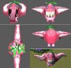
Haha, well, thanks for the strawberry reference. Although this model is based on the ragnarok monster like supertoinkz said, my sister who doesn't play the game called it 'Strawberry man' so the name stuck.

@ CombatTheWombat & X.e.r.e.X: Thank you. But the thing remains it doesn't look good in the game :S

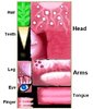
@ Elfsilver Lord: Thanks for pointing out the lack of contrast on the arms. And although I want it to remain pink with white seeds, perhaps your suggestion of red would work if I shade the whole bottom part with red or darker.

I'll be redoing the legs, arms and bottom part of the head then.
 
Status
Not open for further replies.
Top