• Listen to a special audio message from Bill Roper to the Hive Workshop community (Bill is a former Vice President of Blizzard Entertainment, Producer, Designer, Musician, Voice Actor) 🔗Click here to hear his message!
  • Read Evilhog's interview with Gregory Alper, the original composer of the music for WarCraft: Orcs & Humans 🔗Click here to read the full interview.

Hlisk.blp

This bundle is marked as useful / simple. Simplicity is bliss, low effort and/or may contain minor bugs.
Made for the Texture Contest.
Comments always welcome! Enjoy.

Keywords:
bananaHUNT, Naga, Hydra, Hydralisk, Zerg, Sea, Water, Depths, Dragon, Lizard, Snake
Contents

Hlisk.blp (Texture)

Reviews
11:56, 23rd Apr 2009 THE_END: The shading around the edges of the chest scales is horrendously big. Change it Hawkwing: Changes not made.

Moderator

M

Moderator

11:56, 23rd Apr 2009
THE_END: The shading around the edges of the chest scales is horrendously big. Change it

Hawkwing: Changes not made.
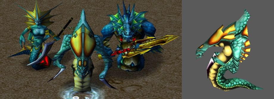
 
To tell you the truth...... You need to seriously rework the fin areas >.> maybe to add more "spines" on the fins and also you should experiment wherever this model accepts alpha so you could have some.. holes in fins and to look more naga-ish in overal.
and second.... Change the colorscheme....everyone in that contest used the darn siren for a model.... >.>;;

Rating: 3.12/5 Aaaaalmost good, but unoriginality of colorscheme ranks it down.

~Misha~
 
Thanks, why do you think to rework the fins? I like them big ;) And alpha didnt work if i am right. Colourscheme i wont change, its fitting better with naga but a tiny bit lighter than siren.

then i suggest puting more details into the fins, like aditional "nedles" as i stated before. and also the nagasummoner skin would suit the fins better, there is the originality i'm (and everyone else i think) asking for.

~Misha~
 
The yellow part of it's front (belly) looks very plain and dull, and could use better definitions (like the one on the Naga Myrmidon for instance).

The rest looks nice and Warcraft-ish. I don't really mind about adding details on the fins or not, but if you do add the details, you can always add some small vein thingies like Denu did on his naga frostwyrm skin wip.

yes, that was my point too ^_^ the more details, the better.
and certainly a fincolor change would be neat. it would not be so.... uniformed >.>
 
Level 14
Joined
Jul 11, 2006
Messages
659
You didn't really try to do much with the hydralisks scythes. You should make it look like its a normal male naga holding twin gold daggers. The head and the stomach scales need more attention. Make the stomach and head more like the male naggas.
 
Level 32
Joined
May 25, 2017
Messages
736
I give him credits for trying to look home enough for Nagas. I do agree the fin is unrealistically big but the scale work is great enough to look like if blizzy work a naga unit like this.

I have seen better naga hydralisk but it's open for competition.
 
Top