• 🏆 Texturing Contest #33 is OPEN! Contestants must re-texture a SD unit model found in-game (Warcraft 3 Classic), recreating the unit into a peaceful NPC version. 🔗Click here to enter!
  • It's time for the first HD Modeling Contest of 2024. Join the theme discussion for Hive's HD Modeling Contest #6! Click here to post your idea!

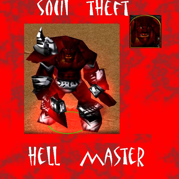
Hellmaster.blp

This bundle is marked as useful / simple. Simplicity is bliss, low effort and/or may contain minor bugs.
beastmaster from hell Textures\Beastmaster.blp

update:-changed armor to make more darker (dark armor)
-added some marks on face
Contents

Hell Master (Texture)

Reviews
18:55, 3rd Sep 2009 67chrome: A large portion of this skin seems to be a bad re-color of the original beastmaster, and the metallic additions could really use some work. You should definitely post your work in the 2D art forums for useful feedback...

Moderator

M

Moderator

18:55, 3rd Sep 2009
67chrome: A large portion of this skin seems to be a bad re-color of the original beastmaster, and the metallic additions could really use some work. You should definitely post your work in the 2D art forums for useful feedback, and looking through the 2D art tutorials on this site might help you out as well.
Anyways, you need to work on the metal to work with the wrap, and you should re-do the skin entirely ;)
 
Colour
Overall, the colour scheme is very plain and simple. with just red and black and white. with a bit of orange. really try to work on using a variety of colours.
3.1/5

Shading and Highlights
There is WAY too much shading and not enough highlights in the skin. you really need to work on making the skin not too dark and try to brighten it up a bit. but the shading is put in the right places to get really good volume in the skin.
4.2/5

Originality and Execution
I like the idea. it may not be the most original (and it may be a bit generic) but i like it. The execution on that idea was "adequately" done but i doont like the darkness of it. the armor was also very awful and looks unnatural. so its very unappealing.
3.4/5

= 10.7/15
= 3.56/5

Rating: Useful

Comments: id say the most unappealing features are the darkness of the skin and the armour. all in all its an ok skin

~Dentothor
 
Level 15
Joined
Jun 14, 2009
Messages
494
i downloaded this skin and the armour look's pretty nice but the beastmaster need's more work maybe color the helmet with other colors and work more on that axes they look bad in-game 3/5 if you changue the skin i will give you 5/5 :wink:
 
Level 38
Joined
Jan 10, 2009
Messages
854
The reddish skin tone of the skin could stand a lot more highlights, it is way to dark right now and will be totally washed out when used in WC3. The contrast on the armor is over done as well, but at least you have the right idea of how to make things look shiny. The armor could use more medium gray tones, and places like the spikes could stand to have more attention payed on how they wrap around the skin.

If you're using photoshop the curves function could help you quickly get the highlights you need while maintaining the right level of shading. Anyways, make the armor less intense and mind how it wraps and should reflect light, and give the skin much more highlights.
 
Level 14
Joined
Jul 11, 2006
Messages
659
It is quite ugly. It looks like all you did was go over the original beastmaster texture with a muddy red brush. You could just change the beastmasters RGB values in the object editor to get the same (but cleaner) effect.

Go check out the other skins out there and go look at some tutorials.

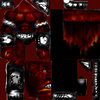
And there is absolutely no reason why this should be 512x512.
 
Top