I like how your style is continually improving, mucho props for that, there's too few terrainers these days that accelerate in the same professional fashion as you are, that
said, I do have some points I'd like to address.
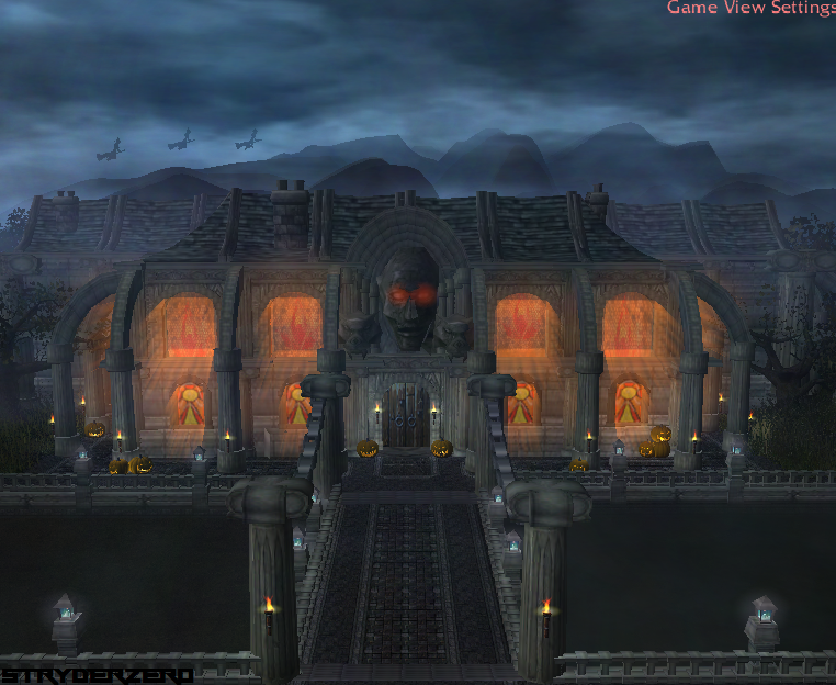
For one, I'm not a big fan of those pumpkins, sure I can appreciate this is a "Halloween" terrain, but they simply just don't fit in with the overall feel, if you really want to keep them around, then at the very least tint them down a notch or two, so they're less obvious. That mostly also goes for all doodads in general, tinting them down a couple 50 numbers or so would probably go a long way in making the terrain seems smoother.
While I can agree to fladders statement that empty isn't always bad, I would like to stress the point that "perfect" isn't always good, this structure looks simply too neat for meat, it looks neat to a point where the general feel kind of gives off this "repetitive" feel. I say, add some abnormalities in between the concrete, a broken part of the fence, some rubble stones scattered randomly about the pavement path bridge thing, maybe have one of the chains look "snapped" and just dangling to the side or downward or something. Just to add variation to the otherwise nicely executed construction part.
I'd also like to stress another point, which is horizon, while indeed you've become a hell of a lot better at doing horizons, I still do in most cases think that the furthest mountain line should in most terrains be one continuous line, sure it can bulge and go up and down, but it should mostly always be one long line that doesn't drop below the mountain tops in front, simply for a neater look. To give a feeling of "true depth" I'd say most mountains at a certain distance just melt together to form such a line, while indeed they might in "reality" be at different distances, they're still kind of too far away that you can't tell, and giving your terrain that self-same effect kind of makes for a better depth to the overall feel of the terrain.
I'm not a huge fan of those witches flying about over the mansion either, but that's just me generally having a beef with units in a terrain. And I'd also advice you do something to the top of the mansion, so that the frontal part's top doesn't meld with the top of the roofs of the latter part, either make the background part different, or lower the frontal part, I'd suggest.
All these are merely tiny details and not big issues, though, cause I really like the terrain.
Good going Stryder, keep them terrains coming!


