-
Listen to a special audio message from Bill Roper to the Hive Workshop community (Bill is a former Vice President of Blizzard Entertainment, Producer, Designer, Musician, Voice Actor) 🔗Click here to hear his message!
-
Read Evilhog's interview with Gregory Alper, the original composer of the music for WarCraft: Orcs & Humans 🔗Click here to read the full interview.
-
Create a faction for Warcraft 3 and enter Hive's 19th Techtree Contest: Co-Op Commanders! Click here to enter!
-
Create a void inspired texture for Warcraft 3 and enter Hive's 34th Texturing Contest: Void! Click here to enter!
-
The Hive's 21st Texturing Contest: Upgrade is now concluded, time to vote for your favourite set of icons! Click here to vote!
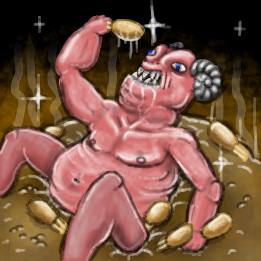
Gluttony
My first icon for the 14th Icon contest.
Theme: 7 Deadly Sin
This is gluttony if you couldn't tell.

Keywords:
food, hunger, cannibalism, healing, health, chicken, feast, demon, devil, gluttony, sins, hell, fat, obese
Theme: 7 Deadly Sin
This is gluttony if you couldn't tell.
Keywords:
food, hunger, cannibalism, healing, health, chicken, feast, demon, devil, gluttony, sins, hell, fat, obese
Contents


 Approved


