- Joined
- May 16, 2020
- Messages
- 660
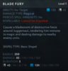
Hi guys,
Maybe a bit of a weird question, but still related to WC3. In my map I use colored text tags to highlight important information.
For example:

However, some information is difficult to highlight, due to the nature of the English sentences. For example " Vengeful Spirit's presence reduces the targets armor by 1." In this case I'd need to highlight almost the entire sentence to make sure the "1" is understood in connection to "armor". Hence I thought I could use the word "induces", i.e. "...induces -1 armor."
For example:

Is this correct English though? Or any better alternative?
Maybe a bit of a weird question, but still related to WC3. In my map I use colored text tags to highlight important information.
For example:
However, some information is difficult to highlight, due to the nature of the English sentences. For example " Vengeful Spirit's presence reduces the targets armor by 1." In this case I'd need to highlight almost the entire sentence to make sure the "1" is understood in connection to "armor". Hence I thought I could use the word "induces", i.e. "...induces -1 armor."
For example:
Is this correct English though? Or any better alternative?