- Joined
- May 7, 2016
- Messages
- 2,175
Hmm, I think the old one is better than the new one. That's my opinion. It would become better if you add color or some effects to the background instead of a black background.
(4 ratings)
 Approved


Hmm, I think the old one is better than the new one. That's my opinion. It would become better if you add color or some effects to the background instead of a black background.
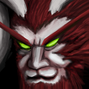
One half of its face should not be entirely in dark, appearing pitchblack, you can indicate shadow without doing that.
I would get rid of that random thing on the left side of the icon and just make the units head instead, just like the reference pic. Other than that it looks pretty decent.
It is okay for his horn to be placed where you put it. The problem is however shading in overall. Add more values in that department. Black on his right side of face would be ok if this wasn't icon for wc3. Vanilla wc3 icons really rarely use such high contrast, so it would be good to draw that side as well instead of black shadow. More definition to his nose, cheeks and mouth would make it better too. If it isn't edited screenshot, it is drawn quite well to fit wc3 style.


Both of them are awesome! They fit well the model. 5/5 good job
is this freehand, or did you use a screenshot of the model?
either way, this is way too high contrast. looks almost cel-shaded. shading needs to be smoother, and colours slightly less bright/saturated. compare this icon to standard wc3 icons to see what i mean.
his nose is also very flat, i suggest googling some reference pics to see how to shape and shade a nose.
good attitude (y)
also work on making the shading more smooth (but not to the point of being blurry). this is a good tutorial that might help you out.
compare your icon constantly to default wc3 ones and try your best to mimic how they're shaded.


Glad to see effort, icon looks better and even fitting into wc3 environment. There are some areas that could be improved more, like adding some highlights on front of his hair and stronger color tones differences in overall, glowing eyes could use as well highlight. However is is surely approvable and I'll give it thumbs up.
For your other icon, those thorns now look like one of those showgirls' boa scarfs and they seem overwhelming in icon size. Make them thinner, spikes can remain in same scale. On the left side the thorn in-between is unnecessary, should go. Same is with thorn that is just above the thorn entangled around helm.


