• 🏆 Texturing Contest #33 is OPEN! Contestants must re-texture a SD unit model found in-game (Warcraft 3 Classic), recreating the unit into a peaceful NPC version. 🔗Click here to enter!
  • It's time for the first HD Modeling Contest of 2024. Join the theme discussion for Hive's HD Modeling Contest #6! Click here to post your idea!

Faerie Fountain - MadseN

Status
Not open for further replies.
Level 9
Joined
Sep 2, 2007
Messages
214
Hello !

Was some time since i posted something new here so i thought it was about time. Got my inspiration to start from the WT at wc3campaigns, I suggest you to check it out, it's very nice and you learn a lot!

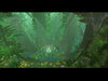
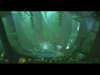
Anyway, the terrain took me about 2 hours to make and should resemble some sort of "Faerie Fountain".

hope you like it! :cool:

[Edit]

(Old)Larger picture here

(New)Larger Picture Here

/MadseN
 

Attachments

  • Faerie Fountain WT 75.jpg
    Faerie Fountain WT 75.jpg
    77.9 KB · Views: 311
  • Faerie Fountain WT 75 Update1.jpg
    Faerie Fountain WT 75 Update1.jpg
    64.1 KB · Views: 218
Last edited:
Level 36
Joined
Jul 1, 2007
Messages
6,677
Meh, it's nice. As usual, very cinematic, and I can think up like 8 stories to go with this! A few things I could point out though, first and foremost the lighting is messed up. Looks like there are two suns, or two big spotlights shining down on the fountain. Also, the plants for some reason in my eyes don't go together. Also, there are bare spots on the top, maybe that's intentional, but it looks odd with the leaf tile.

Edit: The foreground flowers are a bit odd, too... I don't think so many different kinds of flowers would grow like that.
 
Level 25
Joined
Mar 25, 2004
Messages
4,880
Nice to see you're still making terrains!
The terrain as good, but for you, I'd say it definitely is not near being your best. I think there could've been more grass, ferns, and other environmental doodads placed in the front and back of the terrain. The center looks very nice though.

The lighting in this terrain is decent. The beams of sunlight are coming from two different directions and I think it might be taking up too much room, but the light blends great with the fog.

The waterfall is a bit of a disappointment. It looks way too... abstract? There needs to be more greens placed on the left side of the river. Rocks coming out of a tree only looks a bit meh. I can't really think of any good words. Towards the bottom of the waterfall looks very plain especially. I like the log going across the waterfall at the top though; very nice touch.

I'm not completely sure, but it looks like one of those treants makes this terrain look a bit messier, but barely. I'm thinking it's the one on the right.

Overall, it IS a good terrain, but I thought pointing out the boo-boos you made would be best since it is more than obvious that you are one of the best terrainers. Compliments from me for sure, but YOU in particular could've done better.

PS: As ~Void~ said, it is very easy to think of stories to make to go along with this simple terrain shot. +Rep as you do deserve it. :smile:

~Craka_J
 
Level 34
Joined
Sep 6, 2006
Messages
8,873
Meh, just another MadseN terrain. Nothing to see here!

I like this one quite a lot. And contrary to Craka, I think it's up to your par. Except that waterfall. It looks pretty poor compared to the rest.
 
Level 18
Joined
May 27, 2007
Messages
1,689
I like the first one better. I think if you had basically all the same elements in the first, but with the lighting, fog and waterfall of the second it would be better. I also think the waterfall in the second is somewhat more hidden and hard to see now.

The newer one looks too empty, because the first picture, it's like it's a secret foutain, that you came across while trudging through the forest, and the second is like an exhibit you would find at a zoo. I hope my analogy makes sense...

Either way they are good terrains, like we could expect much else out of you though.
 
Level 7
Joined
Aug 10, 2004
Messages
185
The lighting is flawless. And thank you for the WT promotion. XD I like the foreground in the first one better though. But nonetheless the second one is a good improvement. As always, keep it up. :)
 
Status
Not open for further replies.
Top