Doing it right?

Status
Not open for further replies.
Level 2
Joined
Feb 27, 2010
Messages
19
2PPeasantMilitia.png


SCNS.png


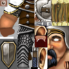
Hi, ive recently begun trying my hand at skinning and want to know if my efforts are in vain or not. I chose the militia skin to start because its one of my favorites.I really don't have much experience at all when it comes to this sort of thing and would value any input.
I'm wondering if i've highlighted the model correctly, if it should be more detailed etc.
This is mainly just for me to learn the techniques and i didn't really have any plan when i started, so im sure the leather straps are not correctly connected (they are distorted by the wrap) and the boots are supposed to be plated greaves, though i don't know if that's really what they look like...
Comments appreciated.
 
Level 2
Joined
Feb 27, 2010
Messages
19
Thanks for the reply! I haven't really been working on the militia skin for awhile though, but i guess i really should finish it to keep up the practice. I don't really have any idea what to do with the arms, i want to make them into flesh and muscle instead of the gloves they have on them currently, but that could turn out bad. Ill see how it goes.

I've started messing around with the murloc skin, and I'd heard that i should re-size the skin before working on it to better control the detail, so that's what ive done.

MurlocE2.png

EDIT: Looks like arms maybe? and not just slabs of pink meat? :confused:
If anyone knows a good tutorial maybe on how to draw in flesh and skin and all that good stuff, I'd love to hear about it.

SCNS2.png


2PPeasantMilitia.png
 
Last edited:
Level 49
Joined
Apr 18, 2008
Messages
8,434
The scales on that murloc look great so far, just a slight variation in color could help. Perhaps also make it more "shiny" with stronger highlights on the edges, like the Murloc already has. As for the militia - I'll just assume the hands aren't done yet. For your first attempt of drawing flesh, I must say that it's very good. What you need to do is to look at some reference pictures of muscular arms, if you want it to be muscular, and attempt to draw defined lines that will help it look like muscles. Look at the Militia's face for example - that line you drew is a good example of what I mean, too.
 
Level 2
Joined
Feb 27, 2010
Messages
19
Thanks again for another reply, i believe i've taken some of your critique into consideration.
The hands are not done, and im having trouble thinking on how to start them, draw in fingers perhaps? I've added more contrast to the arms so that the two portions are more visible; i think this makes it look more muscular, but like you said more lines are needed to really get a good defined shape.

Its really hard to work with how the skin wraps around the model, putting a detail which might appear to be in the right place on the skin might not actually be in the right spot :sad:

Well i found the snapshot function on the viewer, and cause im too lazy to get ingame screenshots I'll just show new changes with those.

MilitiaFlesh.JPG

ss0000.JPG

I also added more highlights to the scales like you said, and i think the result is much better!

EDIT: Hmm, i've just realized that perhaps i've blurred the scales too much (i didnt use blur at all before), might have to fix that somehow...
 
Last edited:
Level 49
Joined
Apr 18, 2008
Messages
8,434
Well, blur is a bad tool as far as I know, same as smudge. To add highlights I think you just have to paint over with a lighter color, or a low-opacity brush. And what I meant was more like the murloc's highlights - since the light comes from the top, you'll have to highlight the top. I meant something very shiny, hopefully you'll understand what I mean by looking at the Murloc's original scales. As for the Militia - look at some in-game textures to see how Blizzard was doing hands. For example, look at the Arthas skin or Grunt skin. Also, yes, you'll have to define the muscles on the arms much more, but it looks better. Anyways, I'm not really a 2D artist and I have no experience in this, hopefully a REAL 2D artist will come here and help you a bit more. Meanwhile I'd suggest you to look at some tutorials from this site or from WC3C.net, I'd recommend Hakwing's "Anti-noobism Texturing", Mr.Goblin's tutorial and pretty much everything that states the basics of texturing.
 
Level 2
Joined
Feb 27, 2010
Messages
19
As for the Militia - look at some in-game textures to see how Blizzard was doing hands. For example, look at the Arthas skin or Grunt skin.
Hmm, good idea, ill take a look at those model's in the viewer.
As for the scales, i think i understand what you mean,

Provided comparison images
ss0001.JPG ss0002.JPG

Somthing like that? though i've only done two of the scales, i believe thats what it should be like, shiny things reflect white. Though looking on it now the highlights should be closer to the upper scales as the sun doesnt reach the lower part as much.

And no, havnt done anything to the shoulders of the militia yet. I'll have to check those tutorials you spoke of to clarify this "alpha channel", but i think it's just invisible on the model, where the teamcolor apears.

@ Kimberly, Now that you mention it, that does make more sense.. >_> wasnt really thinking about that when i started.
 
Level 2
Joined
Feb 27, 2010
Messages
19
Hmmm, i cant help but think im overdoing the highlights here... thoughts anyone?

ss0004.JPG

Also, do the scale outlines look as over-defined as they were before? only worked on the bottom ones so far though.
Im thinking i might have to decrease the contrast between scales further, but i dont want to lose the defined shape that comes with the thicker outlines.
 
Last edited:
Level 2
Joined
Feb 27, 2010
Messages
19
@ debode: I thought so, and i do agree with you about the variation in color. Im thinking that some of the scales could be a different color, like purple maybe? or ill just experiment with the saturation.

@ ike ike: Nice picture, i like visual refrences. And now that i think about it, your probably right about the detail. Maybe you wont even be able to see much of the detail ingame.

Anyways, looks better, worse, any change at all?
Also, purple looks pretty cool imo.

Green!.JPG

Purple!.JPG

Edit: checked out how it looks ingame.. and you can barely see it at all, lol. Makes me think im doing all this work for nothing really...
I think im gunna make the outline a lot more defined, so that its even possible to see it. Either that or just have a really big murloc.

Too small....png

Edit#2: Doesnt really pretain to the skin, but the murloc model that's the one ingame apears as the spikey one ingame but the fin one in the editor...?
 
Last edited:
Level 49
Joined
Apr 18, 2008
Messages
8,434
The Reign of Chaos version of the murloc, which is inside War3.mpq, has fins while the The Frozen Throne version of the murlocs, which is inside War3x.mpq, has spikes. Also, it DOES looks good, you'll have to cover him all with those scales to actually see the detail in-game, the definition is fine and the highlights are epic. Great job so far. I'm curious as to what you're going to do with the rest of the murloc, hopefully he'll be some sort of... Something that is not a murloc? Anyways, what I meant with color variation is to make something like that:

Scales.png

So, you either use different tones of one color, randomly place 3-5 colors or use 2 colors and paint 1 scale green(for example), 1 scale purple(for example), 1 scale green, 1 scale purple, 1 scale green, 1 scale purple... Until you finish his whole body, so it's kinda 50\50 when it comes to the color of the scales. Oh, and... Excuse me for my fail-ish skills when it comes to drawing stuff.
 
Level 2
Joined
Feb 27, 2010
Messages
19
Just giving everyone a heads up that i havnt forgotten about this, just have been a little busy today. Also, i dont know if i should cover the entire murloc body in scales, to be honest that'd take awhile. Im still really slow at this art thing. Besides which, ive tested adding some more scales beneath the ones i already have and they get horribly warped =/. If i do add more i'll have to compensate for that. Thanks for the picture too, i really see what you mean now :thumbs_up:
Dont really know what i'll add after the scales, ill probably look around the site to draw inspiration from.

EDIT: Found a little bit of time to work on the unfinished scales... will do more tomorrow.

Updated.JPG
 
Last edited:
Level 2
Joined
Feb 27, 2010
Messages
19
Sorry for the late reply... been busy.

You could always redraw the scales the way they're supposed to be, like Kimberly pointed out, and cover his whole body with scales.

Apart from me being completely tired of drawing scales, im actually starting to like the way they go, even if its not the most accurate direction. The way Kimberly described sounds to me like what a fish looks like, which isnt exactly what i want it to turn out like.
I added another row of scales because i did think it needed more, but to add more would be a pain because of the way the skin wraps around the model; they get stretched. And although i could compensate for that i'd rather not at the moment.
skinning is supposed to take time, you don't make a skin in two minutes.
Of course, and i do think i am rushing things a bit and that for the best result i should spend the time to redo the scale direction, among other things, but to be honest it'd make me sad to see all that work go to waste :cry:

Anyways, heres a new picture, going to have orange tattoo like things to match his odd color scales i changed to add variation. Although i think i might also change that color, seems a little wierd actually. All i did was change the hue, might be a better way to do it that i dont know about. Also have to shade the skin more, i think.

New!.JPG
 
Level 2
Joined
Feb 27, 2010
Messages
19
Im sort of stuck now, i've added more shading to the body but for some reason i think it needs some more... texture. But i dont really know what i could do to add that (not scales). Im also unsure as to how to proceed on the rest of the skin, particularily the head, shield and fins. Ill try to think of somthing creative.
Here is a picture of it atm, im unsure what i need to add, if anything.

wip.JPG

MurlocEWIP.png

Oh, and thanks for the kind words, takakenji!
 
Level 2
Joined
Feb 27, 2010
Messages
19
Unsure whether I'm allowed to do this (double posting not good), but im still trying to work on this skin and i would value some new feedback. I've redone the old scale things near the head with a large plate scale thing (maybe that's what it looks like...) but it just doesnt look right at the moment. Perhaps it will look right when i get to work on the head? Also, the lack of variation in the skin is still troubling me, still basicly just a flat green with shading. I want to make it look slimy, like a real murloc i suppose, but im unsure of how to achieve this effect.
As a side note, i remember having an old version of paint shop pro or somthing similar, and am in the process of looking for it. Im pretty sure it'd be better to use the GIMP, which im using right now.
Heres a picture of the... frill thing around its neck.

naow.JPG

Comments appreciated!

EDIT: On another side note, i use the path "units\creeps\Murloc\Murloc.mdl" to test the model ingame, which apears as the murloc with a fin in the editor, but when testing it is still the spikey murloc. How can i change this?
 
Level 49
Joined
Apr 18, 2008
Messages
8,434
Well, look at the old murloc skin - he had those orange\red vein-things all over him. They could look cool if you're trying to reskin the murloc into, well, a murloc. Also look at WoW murlocs, they are verrry shiny. You could try to imitate that effect. Also, change the color of that big scale-thing and define it more. Try orange or yellow. For the main body, well, perhaps some armor will do?
As for your other question, in the object editor, you have this field called 'Art - Model File - Extra Versions' or so. Uncheck TFT and check RoC.
In the future I'd recommend editing skins to make them look like something different - for example, retexturing a Naga into some Desert snake thing, or so. I hope you get the general idea. Since, well, retexturing a murloc into a murloc is as unoriginal as it can get.
 
Level 2
Joined
Feb 27, 2010
Messages
19
Still hard at work, mainly on the fin part. I've gotten rid of major parts of the texture, specificly the spikey bit at the front. I've tested it ingame and theres nothing wrong with it, so thats good. I can say im not very creative, and that i looked at http://www.hiveworkshop.com/forums/skins-552/ancient-murloc-cannibal-61823/?prev=search%3Dmurloc%26d%3Dlist%26r%3D20 and really liked how he drew the fin, apperantly disregarding the spikes. However, as is painfully aware in the model viewer, it just doesnt seem to be working that well for me. Its also annoying how the top part of one of the spikes uses texture from the bone-like things strapped to the murloc's side :angry:
I might just try my hand at modeling to remove the spikes entirely...

ss0000.JPG


I took a look at murloc pictures at WoWwiki, and i must say that they look very different then the ones in Warcraft 3. As for imitating the effect, i'd presume that to do that i'd really over-do the highlights to create a sort of glossy appearance. I added another orange plate to the neck area, as it did need some more color variation, and when i tested the model in-game i found out that when he does his stand animation and twists his head, you can see underneath where i textured before and so i really needed to add it anyways.
As for armor, i dont really think that would suit a murloc, but is still an interesting idea.. perhaps made or coral or driftwood, that'd look cool.
Also, thank you for informing me of the Extra Variation's option in the object editor; completely forgot about it!
I see the relevence in your last point about editing skins to look like somthing different, and i'll certainly do that when i've finished with this one. But still, extra variations of a skin cant hurt, can they?

Thanks for all the feedback, debode! sorry for the slight wall of text.
 
Last edited:
Level 49
Joined
Apr 18, 2008
Messages
8,434
It just looks very plain, that's all I can say, really. I don't know, you just need to detail it more. It looks like plain color. That Ancient Murloc Cannibal you linked has some cool design to the fins - as you can see, some sort of bone\membrane\crust... Yours looks like plastic or color to be honest. :/

Also, that Ancient Murloc uses pretty much the shading I meant you should try.
 
Level 2
Joined
Feb 27, 2010
Messages
19
Oddly enough, the original murloc and the one you were referencing don't have any completely visible scales, and that's one major difference. Yours are VERY defined.
True enough on both accounts, i didn't use the reference i linked when drawing the scales, or the original murloc skin. And besides which, i thought that i should add somthing that wasnt present in the original skin instead of just re-drawing it entirely. I made the scales extremely defined so that they could be seen in-game, or so i believe.
In an attempt to add texture to the skin portion, i've added "wart" like protrusions (similar to those found in the linked refrence, perhaps) , which might also seem over-defined but when testing ingame they were invisible and thus i increased the contrast between the shadow and highlight. On another note, does the skin look slightly more "shiny" now? when browsing Mr.Goblins' tutorial i believe i read that to make the apearance of shine, to add some bright yellowish color, which i did.

up.JPG

Havnt touched the fins, which as you said debode look like plastic... ill probably re-do the entire thing. I dont know what you mean by the shading, perhaps because of the color he used it apears much darker then mine? ill ponder it more...

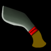
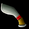
Also, tried my hand at making an icon, still very much WIP

KurkiWIP.png
 
Level 49
Joined
Apr 18, 2008
Messages
8,434
it also needs some detail, else it will look just plain boring

Agreed with that. An awesome background glow, some feathers, some hanging little detail things(just a few ropes with something like a skull or a needle or something), and maybe a more exciting handle would help.

Also, the way you're doing wood is a little wrong. I suggest you to look at some wood tutorials and other people doing wood and find a good reference. Right now it looks like plastic.
 
Level 2
Joined
Feb 27, 2010
Messages
19
Im going crazy... im finding it impossible to add anything else and whenever i try to make the handle look like wood you cant even see the effect at icon size...
So i just played with the lighting a little..

KurkiWIP.png

I've dropped work on the icon for now.. until i think of what to do with it. Might just restart it from scratch.

New idea for the murloc's fin, though. Heres what it looks like so far...

Fin.JPG

Thats the general idea, i've also re-added the spikes because you cant really get them to dissapear in-game, so ill just re-skin them.
 
Last edited:
Status
Not open for further replies.
Top