While I disagree with a few things said on here so far, might I add a few points and opinions.
I honestly thought at first it was based off the paladin and was pleasantly surprised to see it based off the blade master.
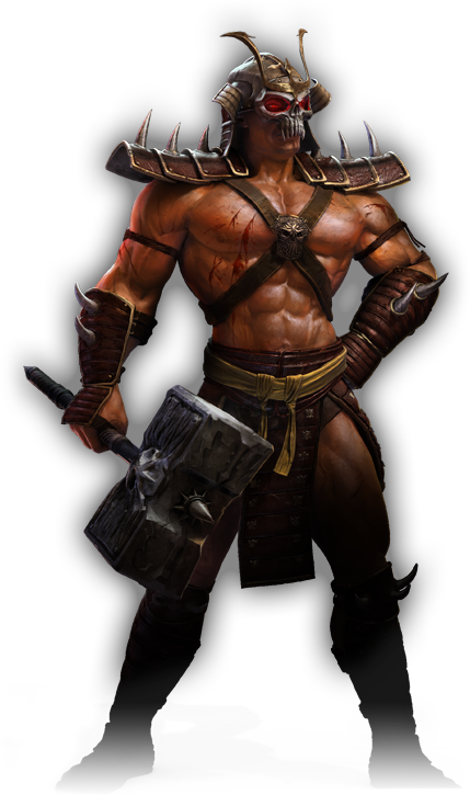
Cons: Attack 2 makes no sense, you should of added a bigger spike onto the hammers top so it at least looks like hes stabbing with it, as supposed to poking things with a big blunt thing.
why didn't you take thralls hammers head? its much nicer and more orcish/evil looking. I think you could also cover the hammers head/handle in spikes.
the shoulder pad really needs work, for some reason I had just assumed you'd looked at the fel guard, well any way, check out the fel guard model for some inspiration on a nicer shoulder pad. its nice and spiky.
the cape being flat black is boring, if possible, try to make that team color, it'd look real nice, but, if it cant be made team color for lack of alpha (honestly don't know maybe it cant be) at least try to animate it some more, its so stiff it makes my nose hurt. at least a small amount of swaying left or right, or just away from him so it vertex clips his back less.
unlike others I like his helm, though I do think its too grey, perhaps use a geoset animation to color it darker brown or something.
pros: whirl wind with a hammer is pro.
hammer doesn't vertex clip his body too badly,
attack slam is awesome
I feel its on the right track, just needs some more work.


 Approved


")
