• Check out the results of the Techtree Contest #19!
  • Listen to a special audio message from Bill Roper to the Hive Workshop community (Bill is a former Vice President of Blizzard Entertainment, Producer, Designer, Musician, Voice Actor) 🔗Click here to hear his message!
  • Read Evilhog's interview with Gregory Alper, the original composer of the music for WarCraft: Orcs & Humans 🔗Click here to read the full interview.
  • Create a void inspired texture for Warcraft 3 and enter Hive's 34th Texturing Contest: Void! Click here to enter!
  • The Hive's 22nd Icon Contest: Creep Abilities is now concluded, time to vote for your favourite set of icons! Click here to vote!

BTNWinterberry

Icon of Winterberry.

90294a03fd73eba8a51d06344166ead8-full.png


Give credits if you will decide to use it.
[/CENTER]
Contents

BTNWinterberry (Icon)

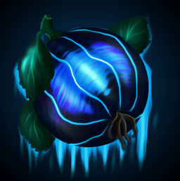
The icicles dropping from the fruit don't seem to have much difference in depth between each other, I prefer the ones on the leaves. It's also a bit odd that the icicles only come from behind the fruit.
Also the right side icicle really bothers me on the small icon size, it is really thick, choppy and stands out a lot.

Looks pretty good anyhow, I like the design and the style.
 
To be honest It is supposed to be like interesting background, nothing special. But I guess it really can be easily misunderstood as bad drawn icicles.

the problem is in the saturation of some colors, bg should be more dull, the bright spots on the "onion" should be dull too, the leaves should be also more light/clear with less shadows and more dull so that they look good on the icon
 
Back
Top