• 🏆 Texturing Contest #33 is OPEN! Contestants must re-texture a SD unit model found in-game (Warcraft 3 Classic), recreating the unit into a peaceful NPC version. 🔗Click here to enter!
  • It's time for the first HD Modeling Contest of 2024. Join the theme discussion for Hive's HD Modeling Contest #6! Click here to post your idea!

BTNWCIFootman

This bundle is marked as useful / simple. Simplicity is bliss, low effort and/or may contain minor bugs.
  • Haha
Reactions: deepstrasz
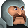
My first icon, and my first submission.
I took the original footman Icon from Warcraft I, blew it up, and re-did it. If this get's approved, I'll do the other Warcraft I icons.

UPDATE LOG:
Version 1: Initial Post
Version 2: Re-did Icon
Version 3: Re-shaded the face, Re-shaded the helmet.

please tell me how I did.

Keywords:
warcraft, warcraft 1, warcraft I, footman, swordsman, human, alliance, stormwind, azeroth.
Contents

BTNWCIFootman (Icon)

Reviews
21:44, 18th Mar 2015 Ralle: 17:29, 19th Mar 2015 Sin'dorei300: Commented. 22:44, 3rd Apr 2015 Sin'dorei300: It shows an improvement compared to the first version, but the metal parts still aren't correctly shaded. Also, the skin color is...

Moderator

M

Moderator

21:44, 18th Mar 2015
Ralle:

17:29, 19th Mar 2015
Sin'dorei300: Commented.

22:44, 3rd Apr 2015
Sin'dorei300: It shows an improvement compared to the first version, but the metal parts still aren't correctly shaded.
Also, the skin color is too faint, the eyes aren't well defined.
That helmet isn't stuck to his head, so there must be some shading between the helmet and his skin.
Where's the light coming from?
Why the helmet has white borders?
I suggest u to read some tutorials and observe some similar themed icons or pics.

00:08, 8th Apr 2015
Sin'dorei300: No changes made. Awaiting update.
 

Ardenian

A

Ardenian

Looks interesting.

I don't know whether it is supposed as I never saw the WCI icon, but his head is not well-proportionated. His top head is too small, but as I said, I don't know whether it is intended by Blizzard or you.

Good job for first icon !
 
Level 7
Joined
Dec 28, 2011
Messages
145
better, now choose a direction where an imaginary light comes from, and shade your icon by that law

I was following the original icon completely, the lighting in the background was like that in the icon. Perhaps in the future I will replace the blue with just solid black but for now, I'll keep it as it is. Thank you for the shading advice though.
 
It'd be nice to see a comparison with the original(wc1) icon.
First of all, the helm lacks a proper metallic texture.
U could take a look at some tuts(http://www.hiveworkshop.com/forums/2...tutorials-281/, Armor tutorial) and helmet pics.
His face lacks shading, fix that.
Lastly, the whole icon needs more definition, try to define its shape better.
 
Level 7
Joined
Dec 28, 2011
Messages
145
It'd be nice to see a comparison with the original(wc1) icon.
First of all, the helm lacks a proper metallic texture.
U could take a look at some tuts(http://www.hiveworkshop.com/forums/2...tutorials-281/, Armor tutorial) and helmet pics.
His face lacks shading, fix that.
Lastly, the whole icon needs more definition, try to define its shape better.

Thanks, I'll look into the tutorials.
also, here is the original Icon, I enlarged it so you can actually see it.
 

Attachments

  • WCIFootmanOrigionalIcon.png
    WCIFootmanOrigionalIcon.png
    1.1 KB · Views: 60
Top