• Listen to a special audio message from Bill Roper to the Hive Workshop community (Bill is a former Vice President of Blizzard Entertainment, Producer, Designer, Musician, Voice Actor) 🔗Click here to hear his message!
  • Read Evilhog's interview with Gregory Alper, the original composer of the music for WarCraft: Orcs & Humans 🔗Click here to read the full interview.

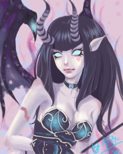
BTNSuccubus

Eredar female or succubus. Hope u like it! ;)

Changes:
V.1.1:
-Made her look more feminine
V.1.2:
-Remade eyebrows and added eyelashes
-Changed color and nose
-Added glow to eyes
V.1.3:
-Changed color(again)
-Added more shading between horns and face
V.1.4:
-Changed her look
V.1.5:
-Changed lips
-Added pupils

Give me credits if u use it in your campaign\map and don't edit without my permission! 'njoy! :)

Keywords:
Succubus, Eredar, Female, Charm, Seduce, Demon, Horned, Queen, Eredar Twins, Hell, Sexy, Torturer, Pink, Beauty, Kiss, Love, BloodElf300
Contents

BTNSuccubus (Icon)

Reviews
20:44, 7th Jun 2012 I3lackDeath: This looks great, you did well to improve this icon. I'd still decrease the size of the upper lip (decrease duck face factor), but that's just me. Keep up the good work!

Moderator

M

Moderator

20:44, 7th Jun 2012
I3lackDeath: This looks great, you did well to improve this icon. I'd still decrease the size of the upper lip (decrease duck face factor), but that's just me. Keep up the good work!
 
Another big aspect why she looks very masculine are her eyebrows. Succubi are VERY sensual (and sexual) beings, so try to embed their aspects.

A very good reference would be dickxunder's Prime Matron model. Check out its portrait, it has all that you want to show with your icon: female facial structures and VERY sensual, aesthetic qualities.

Oh, and keep up the good work! Always nice to see someone work hard on their projects.
 
This one is the best version:
209577-albums5234-picture58564.jpg


The lips are well shaped, the eyebrows are elegant, yet still prominent.
The only things you should change about this one would be:
  • skin colour (keep it redish, pink looks very artificial)
  • proper shading between the horns and the face (it currently looks like a mask, the horns being in the background):
    MaPsBljfaY.png
 
Level 21
Joined
Jul 2, 2009
Messages
2,952
Man you are really improving so damn much.
I'm impressed as well in which this icon went from a male femine Succu to a sexy and hot one. LOL...
 
@13lackDeath
Why to use previous lips? These are much better, imo. :)
As I told you before, the previous lips were well shaped and looked natural.
The current ones look very "procedure gone bad"-ish, artificial (quite too big, and the placement is wrong).

Combine the previous lips with the current state of the icon and it's done.
 
Top