• 🏆 Texturing Contest #33 is OPEN! Contestants must re-texture a SD unit model found in-game (Warcraft 3 Classic), recreating the unit into a peaceful NPC version. 🔗Click here to enter!
  • It's time for the first HD Modeling Contest of 2024. Join the theme discussion for Hive's HD Modeling Contest #6! Click here to post your idea!

BTNScales

This bundle is marked as useful / simple. Simplicity is bliss, low effort and/or may contain minor bugs.
The Scales of Justice
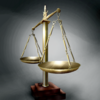
151708d1453081220-btnscales-scales.png

Version 1.0
151805d1453417361-btnscales-oldscales_btn.jpg


Version 1.1
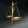
151806d1453417514-btnscales-scales-1.1_btn.jpg


Keywords:
Justice, scales, guilty, court, lawyer, attorney, law, innocent, weigh, weight, balance, beam, legal
Contents

BTNScales (Icon)

Reviews
18:09, 13th Feb 2016 GhostThruster: no changes made, awaiting update. see here and here for a list of things that should be improved upon.

Roland

R

Roland

Now that's some pure justice you got there, Anyway, fix some errors as said from Apheraz.
 
You did read the paragraph in icon rules about Icon Tracing, did you?
This.

Icon Submission Rules:
"Submitted Icon Resources have to be at least 50% freehand work. Filter works, recolors and copy-pasting of other artworks are not considered freehand content. Drawing a complete artwork and then copying/rotating it around multiple times in a single Icon is not considered freehand work!
.....
Icon Tracing is not allowed. This includes, but is not limited to, applying outlines over existing artwork layers; applying existing artwork over the complete icon and using filter effects and layer settings to enhance the icon's details, light sources or shadows; and drawing/coloring over existing artwork and using filters and layer settings to change the appearance of the former to make it look drawn.
It is not considered tracing if you draw by LOOKING at reference images - drawing OVER them IS tracing."

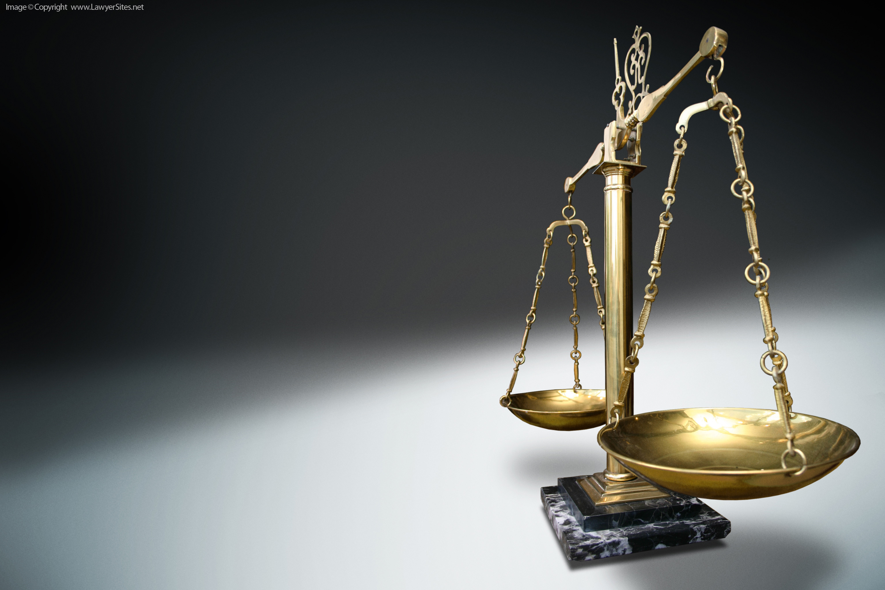
Yes, I read that. I don't believe anything I did breaks the rule. I certainly did not trace. Hold up the image to the reference image you can see that it is not traced. That is the right reference image. I can explain how I made it step-by-step. First I made a long rectangle for the vertical shaft in a new layer over a blank background. Then I filled it with a gradient tool (I set the colors myself). Then I used another layer and made a square. I used "free distort" to give the square perspective. I placed the square above the shaft and in a layer behind it. I then created a new layer and made the arms with a line tool. I then copied the arms and pasted a new one in a new lawyer. I turned the bright down on this one and placed in right behind the first arm. This gives the appearance of a shadow. I then flattened the layers. In a new layer I made the hinge the same way, except that I removed some of one layer to make it look like it was behind the arms. I used burn and dodge on all of these pieces. At some point along here I filled in the background with a huge paint brush. Now for the baskets. I made ovals in separate layers with the circle tool. I used burn and dodge to get the shine. I then created the chain. I used the line tool to make striped of color for the highlight on the long link. I then copied and pasted my links into lines and I used the circle tool with a dark circle and a light circle over it to make the rings. I then copied the whole basket, shrunk it and put it in a layer behind everything. Finally, I made the wooded block base. I used the square tool and then free distort. I duplicated it and made one darker than the first. I then filled in the gaps between the corners with the square tool. I copied this and put it in another layer behind the first block. Then I used the circle tool to make the ring around the base. Burn and dodge all lawyers to create the lighting effects, desaturate, blurr and touch ups. Finally, I repainted the background.

I agree the white might be too much. I'm not sure how to go back in now and change that since, it doesn't save the layers and I did not leave it open over night.
 

Attachments

  • Compare.jpg
    Compare.jpg
    107.6 KB · Views: 136
... First I made a long rectangle for the vertical shaft in a new layer over a blank background. Then I filled it with a gradient tool (I set the colors myself). Then I used another layer and made a square. I used "free distort" to give the square perspective. I placed the square above the shaft and in a layer behind it. I then created a new layer and made the arms with a line tool. I then copied the arms and pasted a new one in a new lawyer. I turned the bright down on this one and placed in right behind the first arm. This gives the appearance of a shadow. I then flattened the layers. In a new layer I made the hinge the same way, except that I removed some of one layer to make it look like it was behind the arms. I used burn and dodge on all of these pieces. At some point along here I filled in the background with a huge paint brush. Now for the baskets. I made ovals in separate layers with the circle tool. I used burn and dodge to get the shine. I then created the chain. I used the line tool to make striped of color for the highlight on the long link. I then copied and pasted my links into lines and I used the circle tool with a dark circle and a light circle over it to make the rings. I then copied the whole basket, shrunk it and put it in a layer behind everything. Finally, I made the wooded block base. I used the square tool and then free distort. I duplicated it and made one darker than the first. I then filled in the gaps between the corners with the square tool. I copied this and put it in another layer behind the first block. Then I used the circle tool to make the ring around the base. Burn and dodge all lawyers to create the lighting effects, desaturate, blurr and touch ups. Finally, I repainted the background...
I'm a fan of freehand(http://www.hiveworkshop.com/forums/2708594-post63.html) works.

Edit:
Imo, the icon should be drawn by hand(freehand), using a simple set of brushes of an art program(not using effects, clever tools and extraordinary features that the used art software presents), ur skills and imagination/inspiration.
No offence intended.
 
Last edited:
I'm a fan of freehand(http://www.hiveworkshop.com/forums/2708594-post63.html) works.

Edit:
Imo, the icon should be drawn by hand(freehand), using a simple set of brushes of an art program(not using effects, clever tools and extraordinary features that the used art software presents), ur skills and imagination/inspiration.
No offence intended.

None taken. What I did here is more like airbrushing or watercolor on the computer. While some of my other work was done with mostly all brushes, I always use some stenciling. I create stencils or masks with the Lasso tool, then use it to paint inside it (stencil) or paint around it (mask). I also use layers and apply color adjustments, i.e. bright, contrast, saturate. In many ways this is like what street artist do when they make those paintings on the street.
While it may not seem as classy as fine arts Oil Painting, I think the style has great artistic value. I understand the preference towards the brush, but I don't think anything I do is less authentic or cheating in anyway. I do not import any shapes or forms. Everything is created from the movements of my mouse, but yes, I do use layers, stenciling and masks. It would be very difficult to create something like these scales with only a brush tool.
 
Last edited:
"It would be very difficult to create something like these scales with only a brush tool"
Why?

Take a look:
http://www.hiveworkshop.com/forums/2d-art-tutorials-281/nfwars-tutorials-178780/
http://www.hiveworkshop.com/forums/members/153758-albums3811.html
http://www.hiveworkshop.com/forums/2d-art-tutorials-281/basic-digital-art-photoshop-257288/
General Icon Process Tutorial
Basic Icons Tutorial
Basic Icon Guide


Edit:
Btw, who needs a perfect/precise circle(e.g) in art, we don't make technical drawing in here.
And u know that i'm not referring at lasso tool & layers, brightness/contrast, simple sharpen filter or common dodge/burn tools. :)
 
Last edited:
http://www.hiveworkshop.com/forums/2d-art-tutorials-281/nfwars-tutorials-178780/ uses the same techniques as I do. This is as much "freehand" as my work is. Mine was just more intricate and I made things one piece at a time, but his techniques are almost exactly the same as how I do each of the pieces.

http://www.hiveworkshop.com/forums/members/153758-albums3811.html uses layers the same way I do. Given that this tutorial is a face with fur on it, there is a lot more brush work.

Basic Icon Guide uses layers, hue adjustments, stencils and dodge/burn tools.

So, I'm not sure what I'm doing that is much different. Do you mean using shape tools? I could make squares with the line tool just as easy, but it saves a few steps to use the square tool. Circles, might be a bit harder, but I could freehand a circle easy enough, but why would I since there is a tool for that? It's like the spray paint guy using the bucket lid. Paint one color and then paint around a simple shape. There's nothing less worthy about that. It's all a matter of style and preference. I will try something else if you suggest something. I did scales because it went with the "justice" theme. Scales require thin chain pieces and metallic dishes. Maybe, I should try an animal or something not so "hard" (as in solid, not difficult). Maybe a judges robe? I was just making things that came to mind.
 
I'm afraid i disagree. :)

And, i repeat:
Who needs a perfect circle(e.g) in art, we don't make technical drawing in here.
U know well that i'm not referring at lasso tool & layers, brightness/contrast, simple sharpen filter or common dodge/burn tools.

In WIP11, on the armor. He selects the plates and uses the burn and dodge tools. That's about all I ever do. I do use the circle tool though. Is that what you mean? I get not using the circle tool, I can do that, but it changes very little. Do you have any suggestions for practice subjects?

Edit:

Attached is a completely freehand attempt (all brush tool). No burn/dodge, no select, no layers and no shape tools. Can you do better? Artists should be able to use all of the tools in their belt. This attitude of "do it like I do, only use the tools I say" is bad for creativity. You also have not given me any of the helpful advice I asked for. Also, if your definition of freehand is the "rule" then it is too vague. You should make it clear. Just list the tools that are allowed and the tools that are not allowed. I will follow the rules even if I don't agree with them but I need to be able to know what they are.
 

Attachments

  • Scales freehand.jpg
    Scales freehand.jpg
    112.4 KB · Views: 111
Last edited:
artists should be allowed to use whatever tools that are available to them. restricting this is as stupid as allowing painters to only paint with one brush size. the only criteria that should rule an icon out is plagiarism (+other site rules ofc) & quality.

that said, the icon needs work. the scales aren't very visible and blends into the background (which itself doesn't suit a wc3 icon very well but we can leave that to stylistic choices). the shading of the background also doesn't match the highlight intensity & light source indicated on the scales

Thank you. I am glad someone agrees with me and your critique of the icon itself was right on point. I think when I made this I was thinking too much about creating a perfect image and I should have been thinking more about creating a nice icon. Maybe if I darken the background and zoom it a little it would look better?

Edit:

How about this? Is that better?
 

Attachments

  • ScalesZoom.png
    ScalesZoom.png
    11.2 KB · Views: 111
  • OldScales_btn.jpg
    OldScales_btn.jpg
    2.7 KB · Views: 127
  • Scales 1.1_btn.jpg
    Scales 1.1_btn.jpg
    3.6 KB · Views: 128
Last edited:
it's better, but imo you should just scrap the icon and overhaul it, except this time focus on creating a nice icon rather than a perfect image (as you say). there's a number of fundamental problems that stop it from being a good icon; namely, the perspective & the shapes used just don't fit the wc3 icon format

this is assuming you want it to look like a wc3 icon. if you just want to get it to an approvable state, i'd make the strings holding up the plates look smoother and less aliased & define the 2 plates & the centre pole more so as to show more depth (right now it looks like a flat shape)
 
Top