

Moderator
M
Moderator
12:34, 19th Jun 2015
Sin'dorei300: Nice outcome!
Sin'dorei300: Nice outcome!
Follow along with the video below to see how to install our site as a web app on your home screen.
Note: This feature may not be available in some browsers.

(3 ratings)
 Approved


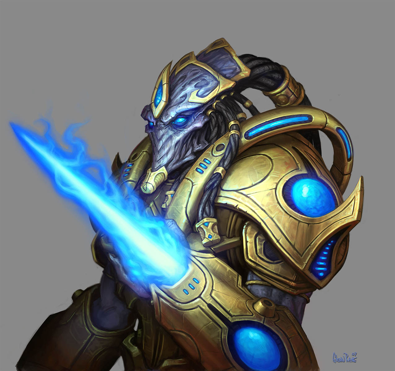
") Why he doesn't has a mouth ?
Why he doesn't has a mouth ?

Why he doesn't has a mouth ?
Very cartoonish, reminds me a bit of CarbotAnimations drawing style.

Thanks.The eyes seem either too small, not well-defined or not glowy enough. I cannot say for sure (it's glow I guess). I'd add the tendrils at the back of his head aswell. Overall this is a great base. With some tweaks here and there, I am sure you can make an excellent end result.
You could slightly decrease the teal glow around his head, it makes the head fading with the bright background.
Additionally, his back head looks strange. I don't see Protoss having cube heads, it looks unnatural(beside the fact they are aliens).


Nicely done!
Though, for a better result u could darken the bg.

Please keep that to yourself!
Your comments on my icons are not required if you keep giving criticism based on your preferences.
Also just to burst open your bubble, I'm not making icons to please each individual's view.
I'll consider listening to your comments after you've changed your take on giving proper criticism and attitude.
Until then we have nothing to talk about.
Exactly my problem with this community.


