• Listen to a special audio message from Bill Roper to the Hive Workshop community (Bill is a former Vice President of Blizzard Entertainment, Producer, Designer, Musician, Voice Actor) 🔗Click here to hear his message!
  • Read Evilhog's interview with Gregory Alper, the original composer of the music for WarCraft: Orcs & Humans 🔗Click here to read the full interview.

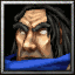
BTNNecromancer

Had some time left before going to bed so I decided to work on making a icon for another one of Stefan.K's recent models, you can find the model here: Necromancer

Process gif:
kovWFIc.gif


256x256
8FknTMf.png

Edit:

Updated based on Maxwells suggestion & few more changes (few pixels on the nose and hair)

T4IJXjY.png
Contents

BTNHeroNecromancer (Icon)

BTNNecromancer (Icon)

Reviews
Maxwell
Approved. Objective opinion: If I where you @Scias, I would define eyes a little bit more. Just like that: --> Not really important, count just like feedback.
Level 34
Joined
Jan 6, 2017
Messages
449
Wow, you did it again. :D

I don't know why, but both Salandria and this icon are better without the blue areas. I like those without it.

Heh, yeah I posted this not too long after I was done updating Salandria. You can tell by the process gif that it wasn't too much work polishing this one - but I'm still really happy how it turned out & how it matches the rest of the Warcraft 3 human heroes.

Yeah I agree about the blue borders, issue with blue borders for Salandria might be because of the color palette (pretty sure original Bloodmage icon also doesn't have blue border because of this), and for this one I feel like the blue border gives it a look like he has spacemarine type of helmet around his head (like a fishbowl or something).. But I keep uploading both variations for consistency. :p

Edit:
I tried changing the colors of the blue border on the top right corner to make it look a bit better, it's not a very noticeable change but it seems slightly better.
 
Last edited:
Level 34
Joined
Jan 6, 2017
Messages
449
Approved.

Objective opinion: If I where you @Scias, I would define eyes a little bit more.
Just like that:

9528d1c441dd3f2df17e41ef87db7156-full.jpg
-->
fc2aec3f7971fb014fae20a13c6b93d4-full.png


Not really important, count just like feedback.

Great suggestion, this gives him more of a character and makes him look slightly more evil/corrupted as a necromancer should look. Thanks, I updated the icon based on this suggestion & changed few more bits about it.
 
Top