Moderator
M
Moderator
10:47, 3rd Sep 2010
Pyramidhe@d: Useful
Pyramidhe@d: Useful
(2 ratings)
 Approved


The sword needs to be more symmetrical.
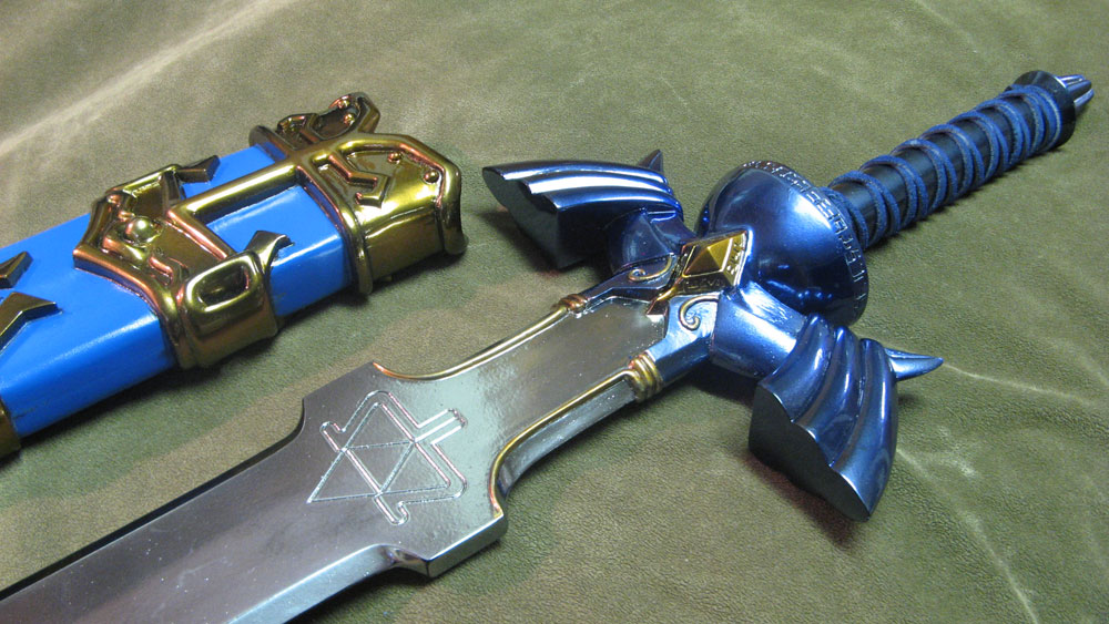
I like the sword, but I unlike the background. It doesn't really fit a yellow triangle with this. Try something else, and I would also suggest a different color, something more threatening and vicious (If you want to make a threatening sword, ofc).
And if you can, work more the highlights on the blade, because as it is now, it doesn't look too sharp.
You would understand why a golden triangle if you played Zelda(This blade / sword is holy, so..)
And yea, As stated before, I wanted to remake the background. And for the blade... Meh, next time maybe.
Can you post a BIG picture please?

Now this is starting to get sex.
I like a lot the new BG and the shiny thing looks nice, but, about the sharpness I try to mean something like this, check the border of the blade.
http://www.hiveworkshop.com/forums/...-153917/?prev=search=sword&r=20&d=list&page=2
Looks pretty sharp.
http://www.hiveworkshop.com/forums/icons-541/btnswordoftheking-151596/?prev=search=sword&d=list&r=20
And this one is the opposite, looks like a sharpless piece of rock.
I redid it. Anything else? I think it looks sharp enough right now. The only thing I should a little continue to do is to detailaze it a little more.
Don't see the difference? Well, look at this then:

Well it looks much better. If I would be an administrator, I would approve this.
Good effort on improving it
No problem, red guy, um, dancing and making music (?)
Well, no more criticism, I see a nice icon there, and dunno if I would change it personally, i think it is okay.
P.S: supercomplicated icons are the best!
OMG I'll finish my requests and I'll start working on icons, I wanna make icons now xD
The hive is spreading some icon-addiction virus.
imo the handle appears a litte too thin, slim, skinny whatever you would like to call it, that might be because of the bg having a such a bright color, the rest of the icon looks great!
I like the sword, but I unlike the background. It doesn't really fit a yellow triangle with this. Try something else, and I would also suggest a different color, something more threatening and vicious (If you want to make a threatening sword, ofc).
And if you can, work more the highlights on the blade, because as it is now, it doesn't look too sharp.
I like the quality of all your icons, they look so awesome! 5/5
(P.S. why is your avatar so spastic? It's wierd. And the expressions are sometimes dusturbing; I'm joking lol!)
Well, if you're ok with everyone seeing your strange facials in full detail, then ok.


