Moderator
M
Moderator
|
Useful.
|
(3 ratings)
 Approved

|
Useful.
|


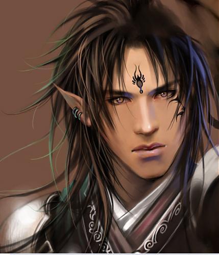
Offensive... :Vtis legolas, most feminine of all elves


also, blackdeath do you have any tips or critique to how to make my icons more warcraft-ish?
well lets say you just grab one of your icon and compare it to a bunch of other warcraft icon.then you compare if they look similar
this includes proportioning or placement/layout conventions. i believe, for example, warcraft icon always show the one end of an weapon related item, not crop off both sides. an ok example would your locust swarm equivalent. it follows the placements but the foreshortening is rather weak in comparison. it also includes rendering style, such as the contrast in the colours, the shading method and general surface textural quality, whther the pic is too grainy or not, got too much details and what not.
and fits this skin well,


