• Listen to a special audio message from Bill Roper to the Hive Workshop community (Bill is a former Vice President of Blizzard Entertainment, Producer, Designer, Musician, Voice Actor) 🔗Click here to hear his message!
  • Read Evilhog's interview with Gregory Alper, the original composer of the music for WarCraft: Orcs & Humans 🔗Click here to read the full interview.

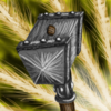
BTNHammer

This bundle is marked as useful / simple. Simplicity is bliss, low effort and/or may contain minor bugs.
  • Like
Reactions: Azsure
It took me a while :)

Her brand new hammer, enjoy.

Updated:
-less contrast
-changed background

Keywords:
hammer, holy, power, light, angel, wrath, smash, bash
Contents

BTNHammer (Icon)

Reviews
16:28, 6th Mar 2010 Pyramidhe@d: Interesting. First i would have to say the bg is stronger than the object. Make the bg a bit toned down. Secondly, your black lines are bit overpowering, making some details stand out and some not, making some of the...

Moderator

M

Moderator

16:28, 6th Mar 2010
Pyramidhe@d: Interesting. First i would have to say the bg is stronger than the object. Make the bg a bit toned down. Secondly, your black lines are bit overpowering, making some details stand out and some not, making some of the shape stand out and some not.

9th Mar 2010
Pyramidhe@d: Now everything is blending in in a big grey mass. Either make the hammer coloured or have the bg a very soft bg.
 
Level 17
Joined
Jul 15, 2009
Messages
632
Not one of your best.

Not to be a uber critic, but as said before it'd be more awesome if the light would come from the bottom of the hammer not diagonal.

Somehow the front 'square' looks angled, and the piece of wood that sticks out is pretty small considering the handle.

The handle itself looks pretty promising though, and the white lines, they are to represent a impact I assume? Might work out with better background, can't say I hate it.
 
Top