Listen to a special audio message from Bill Roper to the Hive Workshop community (Bill is a former Vice President of Blizzard Entertainment, Producer, Designer, Musician, Voice Actor) 🔗Click here to hear his message!
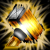
The handle is slightly crooked (not much, but enough to be visible) and the silver parts together with the highlight on the head gives it the look of a lantern. The cross on the small heads side is supporting this interpretation.
The glow looks oddly random and should not overlap the hammer making the icon messy.
At last, i miss the feeling of motion. The lower side of the head has no extra effects indicating a hit nor has the icon some kind of motion blur.
It's decent enough, and I could surely find this useful.. but there's a small case of the bright flash at the middle of the hammer which I'm not too fond of :> 'Gold' can be represented in many different ways apart from that flash.
This site uses cookies to help personalise content, tailor your experience and to keep you logged in if you register.
By continuing to use this site, you are consenting to our use of cookies.


 Approved