• Listen to a special audio message from Bill Roper to the Hive Workshop community (Bill is a former Vice President of Blizzard Entertainment, Producer, Designer, Musician, Voice Actor) 🔗Click here to hear his message!
  • Read Evilhog's interview with Gregory Alper, the original composer of the music for WarCraft: Orcs & Humans 🔗Click here to read the full interview.

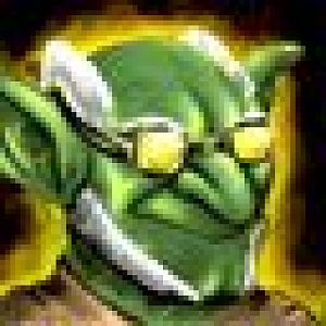
BTNGoblinScienceUpgraded

Just tried drawing goblin on iPad. .-.
Hope i did well.

223472-albums5928-picture75407.jpg


Please Credit me if you use this icon in your map or campaign
Thanks for understanding :)

UPDATE : Old
f2f2b63593949dbd32478ef624ceab43_75410.jpg

New
afca0589747206404176ac4154833b28_75412.jpg


Keywords:
Goblin,Science,upgrade,Unit,green,glasses,warcraft,cataclysm
Contents

BTNGoblinScienceUpgraded (Icon)

Reviews
04:18, 12th Dec 2013 Kimbo: Amazing job there. I feel even though it's your style, it fits into the warcraft feel just nicely :) The shading and anatomy is great. Thankyou for the update and for being patient :) +Approved and works ingame

Moderator

M

Moderator

04:18, 12th Dec 2013
Kimbo: Amazing job there. I feel even though it's your style, it fits into the warcraft feel just nicely :) The shading and anatomy is great.

Thankyou for the update and for being patient :)

+Approved and works ingame
 
Level 26
Joined
Jun 5, 2008
Messages
1,768
Maybe contrast can do the job?

Instead of doodling with the small image, doodle with the bigger image and find a more effective means of resizing it. Doodled with it myself, hope you don't mind.

BTNScienceGobbo.jpg


The steps were really quite easy. First, I resized the large image to 50%. Then I added some contrast. Then I blurred the image. I then used an effect called Automatic Color Balance.
Basically, all that one does is enhancing the colors to be more warm colors. Then I used the sharpen image effect twice, thus giving it more crispness. I then resized it to 64x64

I used Paint Shop Pro 7.0 to do the tweaks. Again, hope you don't mind. Oh and then I slammed it into the Button Manager program.
It's wonderful to see more icon creators starting up. ;P
 
Level 12
Joined
Nov 9, 2012
Messages
235
Instead of doodling with the small image, doodle with the bigger image and find a more effective means of resizing it. Doodled with it myself, hope you don't mind.

BTNScienceGobbo.jpg


The steps were really quite easy. First, I resized the large image to 50%. Then I added some contrast. Then I blurred the image. I then used an effect called Automatic Color Balance.
Basically, all that one does is enhancing the colors to be more warm colors. Then I used the sharpen image effect twice, thus giving it more crispness. I then resized it to 64x64

I used Paint Shop Pro 7.0 to do the tweaks. Again, hope you don't mind. Oh and then I slammed it into the Button Manager program.
It's wonderful to see more icon creators starting up. ;P
Thanks for useful tips mate! And it is ok! :p i don't mind if you try to help me ;D
 

Roland

R

Roland

Looks great! 'Gin! I hope you can make more Better icons! ^^ Great work!
 
Top