Moderator
M
Moderator
16:20, 4th Nov 2014
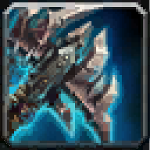
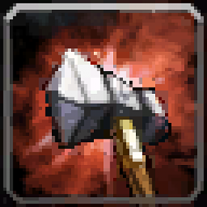
Sin'dorei300: If on the other icon(with the same subject) some omissions aren't payed so much attention, in this one(coz of the effect) those omissions are more observable.
Namely, that handle thingy isn't proper shaded, that happens in others icons of urs too.
It seems like u made them in a hurry and u're no longer interested to improve them. That explains why ur icons have a low rating.
Regarding this icon, the first version looks better than the current one.
The main problem is that your effect looks too solid, so I gave u some examples of Blizzard icons(which i wouldn't dare to criticize). Try to rework that effect, to look less solid.
If u are intrested in obtaining better results, read some tutorials, observe other works showing an effect similar to the one that u wanted to draw and practice.
Awaiting update.


 Approved


