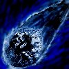
BTNFrostOblivion

Hello!
Very long time ago i made a comet i'll put out later but i've made it to a frostbolt icon now i hope.
Hope you guys like it!
You dont need to leave any credits for me!

UPDATE 1
*Lighted the whole icon up, compared it with other Warcraft 3 frost icons and i realy think *they're fiting together now!
*Added some new details.
*Added some new colours.
*Added some new effects.

UPDATE 2
*Changed the name on the icon from Frostbolt to Frost Oblivion

Keywords:
Frost,Frostbolt,Ball,Ice,Cold,Blue,Meteor,GnomesArePwnzoring,Freeze,
Contents

BTNFrostOblivion (Icon)

Reviews
01:18, 11th Apr 2010 enjoy: It all blends way too much in with eachother. I think you should use more different colors. And why is it so rough looking? Make it more smooth please. enjoy: I'd say might be useful now.

Moderator

M

Moderator

01:18, 11th Apr 2010
enjoy: It all blends way too much in with eachother. I think you should use more different colors. And why is it so rough looking? Make it more smooth please.

enjoy: I'd say might be useful now.
 
Level 2
Joined
Apr 5, 2009
Messages
11
Looks very nice and could be very useful. Doesn't really look like a bolt of ice and frost, but the darkness makes it look a lil' different than the other frostbolt icons.

4/5 and +rep! :D
 
Level 16
Joined
May 1, 2008
Messages
1,605
Ok what we got here ... , a frostbolt. When I saw the icon the first time, I thought if was a first with some blue frostfog around it. After I saw the name and looked again, I was some confused =S

I don't want say this is a bad icon! but it could be more detailed, so all can say "Hey this is a frostbolt" at the first view.

I like this blue ( I name it "fog" now ) and the background is also well done.

Ok lets get everything in points:

+ Works ingame
+ You got all necessary icon types
+ Background and "this fog" looks very good

*
The bolt need some small fixes I think, so you know directly, it's a bolt

Hmm now I would give you 4/5 points. -1 point, because I said the bolt can be better. If you change something I will change it into 5/5

Greetings
The Bomb King > Dr. Boom
 
Level 11
Joined
Feb 2, 2010
Messages
488
Big Picture

I can't see why people is so adicted to the names :p use it as you want.
I just wanted to use frost because it's some ice/frost abbility.
Wow i'm confused :eek: my icons is getting the most comments within less time i think :eek:.
I'd say that it lok like some lich king glove hiting with blue fire
__________________ is very unuseable for me and i just think that posts like that is very anoying.
Not helping, i have no idea now if i made anything good or bad from your opinion....
I'm quite new to effects like frost/fire/etc.
Yes maybe it's quite dark, i know :) But right now i can't make those 3D ice icons with those awesome effects... but my knowledge in iconmaking is growing for each day passing so...
Thanks for feedback guys! I'll try make the icon brigther in some ways!
EDIT:Here is also a big pictureFrostbolt.jpeg <- Before After-> Frostboltr.jpg
 
Last edited:
Level 16
Joined
Dec 8, 2004
Messages
482
To what I assume is a hand needs more definition to set it apart from everything else. Rather seems a bit blurred, and indistinguishable. I'll give you credit for the concept, but the icon itself needs some work.

~Snap
 
Level 11
Joined
Feb 2, 2010
Messages
488
Okaaay i guess :)
Even though i think the white line around the comet and it's tail, is separates it from "evrything".
This is like the only i icon that has no blurry at all from my opinion :/.
I'll try change it in so many ways that you guys want, thanks for the feedback.
 
Top