Creator, I can give you a few tips about icon making.. not about drawing them hehe, I'm not good at that, but about making the file non-blurry and etc.etc.
1. After resizing your image to 64x64 icon you should Sharpen it with the Sharpen Tool (whether it will be Photoshop or Gimp, doesn't matter I believe). Around 20-40% sharpen is good.
2. Use BLPLab to convert your images to blp, not war3 viewer. War3 viewer adds a lot of blur.
3. Darken the edges a little, fix some pixels that became too sharp on the 64x64 IMAGE. Not on the huge one.
4. Don't add too much detail on the huge image, cuz it fucks up the ending result.
5. Ehm.. what else can I say... For many icons, it is good to add a little contrast from the Tools thingies or whatever it was (after resizing to 64x64).
Now for my opinion about this icon

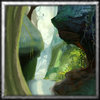
Man.. the right part, Amazing. The left part is a bit blurry and.. non-formed/shaped and a bit out of the scene.. and not matching the right part. Reword the left part actually

It's really good! But focus on making 1-2 simple objects when it comes to icons.. there are only a few good Landscape icons I've seen, and they were Blizzard's achievement icons.
Overall, for a painting, this is amazing.. for an icon.. I don't know. Better try making an object or something.. like a weapon, shield.. a.. hmm. A human being blessed, or a spell being cast on some tree if you prefer Scenery stuffz.
+repppp =) I like it! Iz good.
edit: sry I gotta share to give you rep man

URgh. Damn sharing D:


 Approved


 Man.. the right part, Amazing. The left part is a bit blurry and.. non-formed/shaped and a bit out of the scene.. and not matching the right part. Reword the left part actually


