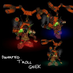
These are two different icons, and both are nice, but they have the same problem.
The bg being black and a part of his face being black too, it's a bit hard to stand out one from the other.
I only suggest u to delimitate somehow the black face from the black bg.
U could, for example, to make his face less black or to increase a bit those reflections(where it's needed) to pop up his features. Another solution could be to change the bg.
Btw, i prefer the first version, it's much better, imo.
 Approved


