• Listen to a special audio message from Bill Roper to the Hive Workshop community (Bill is a former Vice President of Blizzard Entertainment, Producer, Designer, Musician, Voice Actor) 🔗Click here to hear his message!
  • Read Evilhog's interview with Gregory Alper, the original composer of the music for WarCraft: Orcs & Humans 🔗Click here to read the full interview.

BTNDragonFire

This bundle is marked as useful / simple. Simplicity is bliss, low effort and/or may contain minor bugs.
  • Like
Reactions: deepstrasz
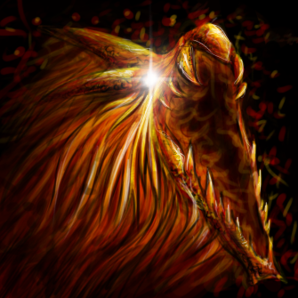
Phoenix Fire, Dragon Breath, Dragon Missile, whatever you may think it is. I was inspired by Jhonny Janbo's Fireworks Dragon Head.


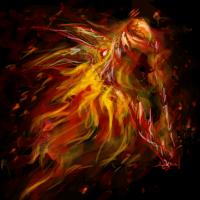
Actually, it has two versions: Dragon and Phoenix, I kept the dragon version cuz I prefer it to the Phoenix. The phoenix one doesn't look like "Missile". Anyway, I put the Phoenix version in Passive, I hope there's no problem with that :\


Edit it if you want and DO NOT give me credits. Thanks in advance.


Large version(s):
209078-albums5714-picture66048.png

209078-albums5714-picture66089.png


Keywords:
Phoenix Fire, Dragon Breath, Dragon, Phoenix, Missile, Dragon Missile, Moose.
Contents

BTNDragonFire (Icon)

Reviews
I3lackDeath Awaiting UpdateDate: 2013/Mar/01 15:57:39 Reasons:Commented. [TR]Staff Contact Submission Rules
Level 14
Joined
Sep 17, 2009
Messages
1,297
The shape is really good, but i suggest you to use more darker colors inside the mouse, and a more lighter for defining the shape. Maybe cartoonizing it a bit to make it more blizzardish.
Also, zoom in if possible because it would make the awesome parts visibile.
 
"Darker colours" ≠ use black and shade over existing colours.
Stick to the chosen colour scheme and pick a darker shade of colour.

Additionally, as previously suggested by kari0003, zoom in, plus define the whole shape more. The dragon skull is hardly visible at the moment.
This is an example of how a defined fiery object can look like:

Last but not least, emphasize the core of your fiery bolt with a bright shade of orange/yellow, or even almost white, to symbolize the origin of heat (the brighter a spot within flames, the hotter it is). There are plenty of examples for this.
icons_596_btn.jpg
icons_2767_btn.jpg
 
Level 28
Joined
Aug 7, 2011
Messages
1,638
yes, I was thinking to make it more like this Fire Breath icon... hmm, well, I'll see what I can do.

edit: Ok, I can't do it, it's too hard to fix this mess, I tried using bright colors, but to no avail :\ It looked even more shitty.
add: And when zoomed it, it looks a bit more... hmm.. well, not so Missilish, I mean, it looks like a fire dragon head which makes no logic without the trail.
 
Last edited:
Top