• 🏆 Texturing Contest #33 is OPEN! Contestants must re-texture a SD unit model found in-game (Warcraft 3 Classic), recreating the unit into a peaceful NPC version. 🔗Click here to enter!
  • It's time for the first HD Modeling Contest of 2024. Join the theme discussion for Hive's HD Modeling Contest #6! Click here to post your idea!

BTNCombat

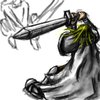
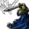
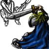
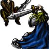
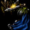
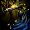
an icon i put a lot of work into. about 4 hours. i think it is my best so far. hope you like it!

Keywords:
combat, pala, human, strike, slash, parry, sword, fight,
Contents

BTNCombat (Icon)

Reviews
17:36, 20th Sep 2009 zombie2279: Definitely a very creative, good looking and useful piece. It takes you a while to figure out the two fighting characters and the coloring of the blonde guy's cloak is messed up, but otherwise it's awesome. 4,5.

Moderator

M

Moderator

17:36, 20th Sep 2009
zombie2279: Definitely a very creative, good looking and useful piece. It takes you a while to figure out the two fighting characters and the coloring of the blonde guy's cloak is messed up, but otherwise it's awesome. 4,5.
 
Level 34
Joined
May 1, 2008
Messages
3,212
:psmile: Looks really great, Palaslayer! But maybe you could make some improvements: the upper person should be more visible, put him lower. Maybe, the sword clash should be more sparkly and epic. I don't think that the yellow glow on the cloak is really important, to be honest it doesn't really look like glow, how about just keeping the cloak blue? And the hair color, now it looks like 75% yellow 25% green, when it should be 75% yellow and 25% orange, in my oppinion. With improvements, I would higly reccomend this icon, but for now, I'm just reccomending it.
 
Level 8
Joined
Mar 28, 2009
Messages
247
The center point of the icon is to high because the other guys head gets sloughtered by the boarders which makes him hard to notice. At first i though it was a knight getting into some weird fighting position you see only in movies. The quality of this icon is rather good except it needs some minor fixes as FrIkY mentioned.

Also some light rays coem from a diffrent direction than it's center ? Am sure you intended that and i think i know what you tried to show but in my humble opinnion it would look better of the came from one paint. Although am not 100% sure so am jsut kinda pointing that out... Yeah...

Pretty good for now 4/5 :)

off topic
It kinda makes me think of a knight dancing to a disco ball, yeah let's all party :D I mean the icon doesn't look like that but my nebulous mind gives me suggestions ;)
 
i feel a new wind blowing through the icon section. there have been many good icons the last two days! hc, do you know what i mean?
Yeah, I know. I see a lot of effort from the hive's artists put into their icons, lately.
Let's keep working hard on it! =)

btw, your icon...
Looks fantastic.
You should consider moving the other guy downwards though...so this icon's awesomeness can be appreciated fully. =P
 
Level 9
Joined
Jan 23, 2009
Messages
896
Obviously a gorgeous piece of work and art.. Looks useful, sensible, and well-rendered. Shading was well done, and colors were definitely very good too. However, the leaping attacker is barely visible and I could hardly even tell he was there at first glance. You should make him more pronounced, obviously.
5/5 Highly Recommended
 
Top