Listen to a special audio message from Bill Roper to the Hive Workshop community (Bill is a former Vice President of Blizzard Entertainment, Producer, Designer, Musician, Voice Actor) 🔗Click here to hear his message!
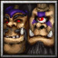
A member of the website messaged me with a request to make icon for Cho'gall model made by Tauer, I took upon the request since it seemed like a challenge and something different to make since I didn't try fitting 2 heads into one icon yet..
Process is same as my usual process, screenshotting the model, resizing the image then color reducing to create blobs that I polish with pixel art methods.
I'd move the left figure down and resize it as its chin looks like quite dominant feature. Different perspective would help as well.
However it looks nice and got a character. Approved.
Thanks.. It took a lot of effort to make them look more like ogres especially the head on the left, the mustache and the hat-looking thingy made it read as a Centaur to me and it took awhile to figure out how to ogre-fy it.
Thanks.. It took a lot of effort to make them look more like ogres especially the head on the left, the mustache and the hat-looking thingy made it read as a Centaur to me and it took awhile to figure out how to ogre-fy it.
A friend of mine made the layer for me, since I'm totally photoshop(insert all the other more advanced programs here) dumb.. I was having difficulty creating the border and she made it in like 2mins haha
Here's the layer if you wanna use it:
One issue about it is that it applies the blue to the inner outline of the grey border of the icon, so I have to touch it up afterwards a bit (if you apply it to 64x64 icon).. I also add the 2 inner shades around the edge by changing darkness of the picture by -50 then taking 1 row of shadow and then reducing the already darkened picture by -50 more to get the first row of shadow.
Like so:
While working on it I felt like the right face is the more dominant one and felt like there's little I can do to improve that, but as I was changing and trying to stretch the other face a bit to make it look more like ogre I think I managed to make it stand out more. I'm not sure if the chin makes it the more dominant one though, I feel like they're about same since the right one has some interesting features about it that grab attention.. And with the blue border on the chin is quite covered.
As for perspective maybe I should've went with something that would make the faces look like they're more part of one body, since currently there's a bit too much separation going on between them and sometimes I can even see it as 2 separate portraits.
This site uses cookies to help personalise content, tailor your experience and to keep you logged in if you register.
By continuing to use this site, you are consenting to our use of cookies.

 Approved