• 💀 Happy Halloween! 💀 It's time to vote for the best terrain! Check out the entries to Hive's HD Terrain Contest #2 - Vampire Folklore.❗️Poll closes on November 14, 2023. 🔗Click here to cast your vote!
  • 🏆 Texturing Contest #33 is OPEN! Contestants must re-texture a SD unit model found in-game (Warcraft 3 Classic), recreating the unit into a peaceful NPC version. 🔗Click here to enter!
  • 🏆 HD Level Design Contest #1 is OPEN! Contestants must create a maze with at least one entry point, and at least one exit point. The map should be made in HD mode, and should not be openable in SD. Only custom models from Hive's HD model and texture sections are allowed. The only exceptions are DNC models and omnilights. This is mainly a visual and design oriented contest, not technical. The UI and video walkthrough rules are there to give everyone an equal shot at victory by standardizing how viewers see the terrain. 🔗Click here to enter!

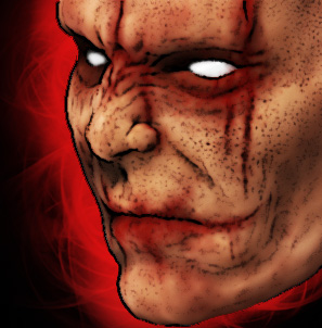
BTNchaoschosen

I made this icon for my map Warhammer 3rd Storm of Chaos for a hero called Chaoschosen.
Well to be honest i didnt implement that hero yet, but i wanted to make a cool looking icon :p
I think this icon can be used as icon for chaos/dark/evil humans aswell as for passive or active abilitys such a kind of unit.
And to be most honest i have to say this icon is based of a screenshot of a model i made in zbrush.
For dudes who dont believe i am a great artist, here is a vid u should watch:

http://www.youtube.com/watch?v=xE51TLtmYzk

critique plz

Keywords:
Warhammer, Chaos, Chaoschosen, Chaoschampion, rage, fury, anger, hate, hatred, haze, head, chaosstar, evil, dark, bad, mad
Contents

BTNchaoschosen (Icon)

Reviews
13:19, 15th Jul 2009 zombie2279: Even though the majority is not freehand, it turned out to be really awesome and since the original artwork is by you aswell, I'll approve this for now.

Moderator

M

Moderator

13:19, 15th Jul 2009
zombie2279: Even though the majority is not freehand, it turned out to be really awesome and since the original artwork is by you aswell, I'll approve this for now.
 

The Panda

Icon Reviewer
Level 57
Joined
Jun 2, 2008
Messages
8,834
Although quite nice you might wanna give us just a big picture of this just to make sure.

Review,
------------------------------------
1:Some of the skin needs to be reworked.
2:Lips can be better.
3:Background needs to be a little more vibrant and better.
------------------------------------

(All my recommendations to your icon, you can choose to use these or not, your choice.)
Army-of-pandas.
 
Level 9
Joined
Jun 3, 2007
Messages
185
about the skin i have lips i have to aggre, they dont look too great, but the skin is ok like that in my mind. well i didnt make that 4 a high rezz pic, u know @ 58 x 58 pixels noone cares about this 2 pixels of lips i thought.
 

Attachments

  • chaoshead1.PSD
    3.1 MB · Views: 196
  • chaoshead4.PSD
    3.1 MB · Views: 156
  • greenface.PSD
    2 MB · Views: 123
Level 36
Joined
Jul 1, 2007
Messages
6,674
man your realy hard are ya?
i have nothin about constructive qritique, but saying it fails as an icon doesnt help a bit...

I'm a real harsh critic.

Anyways, I just don't think the perspective works for a WC3 icon. Maybe if you rotated the perspective a bit to the right, so we could see more of the face, it would fit better with other WC3 icons.

Furthermore, I suggest you flip the icon horizontally, because the main use I see for this is as a hero icon, and in its current state, it would be facing an odd direction in game.... It would be facing off the screen.

Oh, and don't forget to add a neck. It looks like a severed head right now, and if that's what you intended it to be, this is a completely wrong perspective for a severed head :p
 
Top