Community
Maps
Tutorials
Gallery
Support Us
Install the app
-
Listen to a special audio message from Bill Roper to the Hive Workshop community (Bill is a former Vice President of Blizzard Entertainment, Producer, Designer, Musician, Voice Actor) 🔗Click here to hear his message!
-
Read Evilhog's interview with Gregory Alper, the original composer of the music for WarCraft: Orcs & Humans 🔗Click here to read the full interview.
-
Create a faction for Warcraft 3 and enter Hive's 19th Techtree Contest: Co-Op Commanders! Click here to enter!
-
Create a void inspired texture for Warcraft 3 and enter Hive's 34th Texturing Contest: Void! Click here to enter!
-
The Hive's 21st Texturing Contest: Upgrade is now concluded, time to vote for your favourite set of icons! Click here to vote!
You are using an out of date browser. It may not display this or other websites correctly.
You should upgrade or use an alternative browser.
You should upgrade or use an alternative browser.
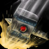
BTNBash
- Author(s)
- Panda
- Size
- 48.07 KB
- Rating
-
(8 ratings)
- Downloads
- 583
- Created
- Jul 4, 2017
- Updated
- Jul 4, 2017
- Resources
- 1
- State
 Approved
This bundle is marked as recommended. It works and satisfies the submission rules.
Slams his hammer down on his enemy's, slowing and stunning them for 5 seconds. Can be used for any type of unit.
Contents
BTNBash (Icon)

btn

disbtn

pas

dispas

atc

disatc

att
- Size
- 48.07 KB
- Uploaded
- Jul 4, 2017
- Updated
- Jul 4, 2017
- Joined
- Dec 29, 2014
- Messages
- 2,036
Inspired by this? Warchief Thrall
- Joined
- Jun 2, 2008
- Messages
- 12,759
Inspired by this? Warchief Thrall
Yessir!
- Joined
- Jun 2, 2008
- Messages
- 12,759
No prob!Neat, thank you.
- Joined
- Sep 23, 2012
- Messages
- 1,307
The whitish trail is kinda overdone and unfitting with the slam effect in my opinion.
I also thought about adding a thin red trail for the red gem on the hammer, not sure if it will looks better though.
The yellowish highlight on the gem looks kind of weird too.
Hope you don't mind my blabbering, just telling what I sees.
I also thought about adding a thin red trail for the red gem on the hammer, not sure if it will looks better though.
The yellowish highlight on the gem looks kind of weird too.
Hope you don't mind my blabbering, just telling what I sees.
- Joined
- Mar 22, 2016
- Messages
- 588
I'll approve it, it is drawn nicely, but the color scheme could be better, consider changing it for the key elements to be more cohesive: gem, the effect, blue tracks across hammer. Also, aside from gem, image could be less desaturated.
Movement illustration could be connected more with the background rather than with foreground, like below example there is a light outline and movement effect appears to be attached behind the object:

This is important because you don't want to give too much focus on the effect, but to the main subject which is hammer itself. Both effects (movement effect and yellow effect) should be ''lower rank'' of importance compared to it, because otherwise image gets crowded with information that aren't contributing to overall illustration much. That's why it is better to keep ''add-ons'' away from foreground and if possible to keep them subtly merged into background.
Movement illustration could be connected more with the background rather than with foreground, like below example there is a light outline and movement effect appears to be attached behind the object:
This is important because you don't want to give too much focus on the effect, but to the main subject which is hammer itself. Both effects (movement effect and yellow effect) should be ''lower rank'' of importance compared to it, because otherwise image gets crowded with information that aren't contributing to overall illustration much. That's why it is better to keep ''add-ons'' away from foreground and if possible to keep them subtly merged into background.
- Joined
- Jul 15, 2007
- Messages
- 763
A very nice, high quality icon. Can't fault it personally!
- Joined
- Apr 13, 2008
- Messages
- 1,610
Looks great!


