• 🏆 Texturing Contest #33 is OPEN! Contestants must re-texture a SD unit model found in-game (Warcraft 3 Classic), recreating the unit into a peaceful NPC version. 🔗Click here to enter!
  • It's time for the first HD Modeling Contest of 2024. Join the theme discussion for Hive's HD Modeling Contest #6! Click here to post your idea!

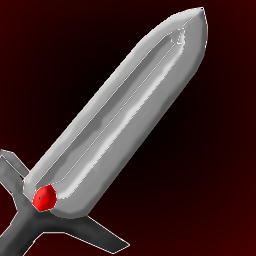
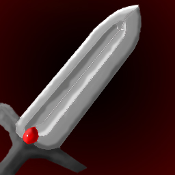
BTNIronSword

Drew this icon today to kill some time.
Hope it's good enough.
Big pic below:


153485-albums4312-picture44157.jpg


153485-albums4312-picture44160.jpg


Give cred if used ^^
Enjoy!

Update: removed white lines
Update2: saved the blp in the original size instead then resized with Button Manager.
(Right?)
Update3: did 2, but did not fail hopefully...
Update4: Added a red glow around it and some more shadows/details..
Update5: Centered the sword
Update6: Added some more contrast! :) (cred to enjoy for explaining it to me!)

Keywords:
Iron Sword, Sword, Iron, Blade
Contents

BTNIronSword (Icon)

Reviews
02:18, 18th Mar 2011 enjoy: It actually looks nice, but I think you should add a bit more contrast, and center the sword just a tad more. :) 06:09, 22th Mar 2011 enjoy: Very good :)

Moderator

M

Moderator

02:18, 18th Mar 2011
enjoy: It actually looks nice, but I think you should add a bit more contrast, and center the sword just a tad more. :)

06:09, 22th Mar 2011
enjoy: Very good :)
 
Level 9
Joined
Jul 23, 2008
Messages
261
Thanks for your comments! :)
Ofc I can improve it ^^
Tell me exactly what your bugged about :3

In my own opinion, it looks great in the small version (The actual icon)
And I think that drawing to much on the big version then reducing it will just kinda mess up the icon :O
But i'll save this and try improve on the already mentioned parts then i'll notify you so you can take a look again ^^

EDIT:
removed white lines :p
 
Last edited:
Level 9
Joined
Jul 23, 2008
Messages
261
@D4RK_G4ND4LF
You mean when I turn it into a blp I shouldn't compress it to much?
or when I lower the size?
I srsly can't see anything wrong with the small icon :p
Maybe it's just me but anyhow.
Just tell me more specific what to fix and maybe an example so I get more what you mean? x)
 

sPy

sPy

Level 21
Joined
Apr 10, 2009
Messages
268
Hmmm I can guess you weren't using GIMP. If it's true then you should use it, it gives better result :D

Anyway, about the sword, I think you should make a different shape since there's already a lot of them. You can search them if you don't believe it. So, to make people download YOURS, you should make the sword has something unique, something special (try to think about it).

Try to read some tutorials about shadings too. I suggest NFWar's tutorial, it totally helps me so I guess it'll help you too.
 
Level 19
Joined
Feb 4, 2009
Messages
1,313
I attached 2 pics showing your image and how it should look like if you compress it properly (both are 64x64)
just use the button manager from the tool section and use its scaling feature
of course it will look even better if you use gimp and scale manually to peserve the details
 

Attachments

  • pic1.png
    pic1.png
    263.1 KB · Views: 111
  • pic2.png
    pic2.png
    202.3 KB · Views: 112
Level 9
Joined
Jul 23, 2008
Messages
261
@sPy
Ok, downloading Gimp :)
I just resized it in the prog I painted it in :S isn't that good?

@D4RK_G4ND4LF
Didn't really get your pics.. But the gimp thing I got!

i'll give it a shoot and upload it!

EDIT:
Saved it as a higher quality.. Also saved the BLP in the original size then let the button manager do the resize work instead of the actual drawin prog :p
 
Top