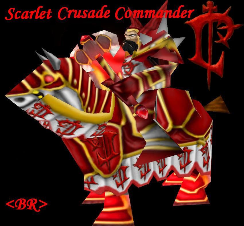
All right, didn't see the concept you posted for this before.
You should make the robes pink like they are in the concept, and mirror the Lordearon symbol for every other placement like it is in the concept. For WC3 it's still rather detailed though, I'd suggest making your own simplified version of the L and using it throughout the skin.
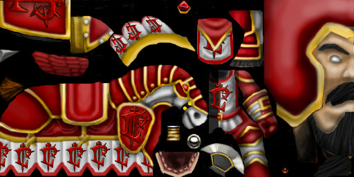
Also, make each type of armor on this a unique shade of a reddish color. If you look at the horse nothing is 100% red, there are pinks, browns, dull reds, magenta-ish reds. Use red as a basis for the theme of the skin, but don't confine it to one shade is basically what I'm getting at here.
Also - the yellow stands out way to much. a good base color for gold is around halfway between yellow and orange, totally saturated and gray. (If you are using photoshop I would also highly recommend you place all the gold on the same layer).
From there use dodge and burn to make it look more shinny. A decent amount of the trim on you concept has a rather desaturated look though as well.
Overall this skin is to bright and saturated though, most scarlet crusaders look like their armor is put to use on a regular basis. With browns, faded reds, and pinks the dye job on their armor generally looks like it was done with medieval technology as well, at least most of my favorite crusaders.
 Approved


")