 Approved


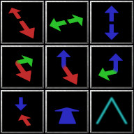
I enjoy the ideia, but think the arrows' bases shouldn't blur and mesh together. If there were a sharp and angled line between them it would favor the perception of depth.
Maybe if you add a background grind to the icons they could become more visually appealing!
Maybe if you add a background grind to the icons they could become more visually appealing!
