
Moderator
M
Moderator
02:02, 6th Feb 2010
enjoy: I sense smudge tool abuse. well.
Creative and might be useful.
enjoy: I sense smudge tool abuse. well.
Creative and might be useful.

(2 ratings)
 Approved
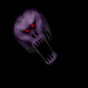
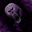


...or better yet, needs a background. the latter would be nicer as you've gone to so much trouble to make the whole thing look so well and it'd be a shame to cut it out, but yeah.


Make it bigger, theres alot of black areas.

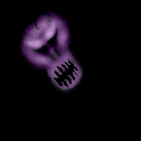
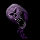
90% smudge 10% freehand
If people have constuctive criticism, ways to improve an image, or words of encouragement, they should by all means offer it. Otherwise, it's just another meaningless and useless opinion. If anyone is interested in how I, or anyone else creates an image, try asking. //\\òó//\\
BTW, the smudge tool has its uses; like making steam, cloud effects or other areas a blending effect is needed. When drawing in pencil I use a tortillon or blending stump, and it is in no way less freehand. Smudging is, however, terrible at creating definition, which is why I am fond of using the paintbrush, airbrush, noise, and lighten/darken tools (roughly 99% of the image, if it matters). Occasionally I'll use the shapes, mirror, flip, rotate, colorize, soften, and sharpen tools (about 1% of the image) when needed to create symmetry, shades or texture. I have Paint Shop Pro XII, and a mouse. Not expensive or elaborate tools, but adequate.
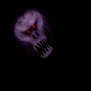
To create good definition in an icon, I'll actually tweak it pixel by pixel (especially around edges) which is why I don't do really large versions (I'm not nearly as good as many of you are, and it would take me forever). The final version is only going to be 64x64 pixels, and I believe that is what's important. If you're happy with it, I've accomplished my goal!
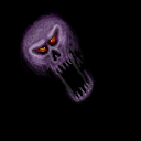
the icon space could be more satisfied
does't seem 50% freehand
