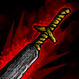
I think I told someone here before, it is always a good idea to take a look at image you are working on for longer time from different angle, for instance flipping the image horizontally, you'll spot the flaws easier. I like the angle, but you should make some improvements to the metal.
Pure black should not be present in larger areas of coloring in foreground objects, it should be reserved for backgrounds. There is no need for high contrast in foreground unless you want to emphasize something specifically, here is no need for that as object hasn't got effects, it is a single object illustration and it needs balance in all its parts. Try to tone down the darkest parts so that the difference between brightest and darkest point are in closer range, like these two examples:


-this is one of the most defined icons in wc3 and probably one of the best to present ''wc3 feel'', it is very clear and ordered, uses very low contrast and technical aspects are subtle: colors, shading, outlines. Take a look at the outlines, they aren't black, they are just darker shade of main color used and they aren't thick, they are thickest and darkest in certain areas to emphasize the style or where it was needed to define the hand. It would be very good for getting wc3 feel to apply the same outline method to your icon (the naga thing above works the same, but it isn't very defined, outlines got smudged in icon size).

 Approved