
 Approved

Moderator
M
Moderator
12:47, 19th Mar 2010
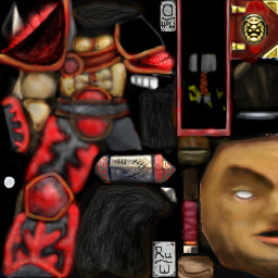
67chrome: The freehand work done on this seems lacking, right now it seems more like plastic due to how you shaded it. Surround the portion of the skin you are working on in a selection so you don't have to worry about coloring outside the lines, and shade the skin based on how the light is hitting it rather than placing the highlights in the direct center of the piece you are shading. (the top of the chest looks a little weird due to this). I like the chest, though it seems a little fuzzy - the edges of the muscles should have a crisper line then they do now.
The pink armor is really adding to the plastic feel, if you are going for red make red the highlights, and just make the shading darker shades of red. If you are going red make it more saturated to, pastel red that gets lighter=pink. The red on the hammer is particularly out of place, blood is a totally saturated bright red, and if it gets on anything typically a much darker red. Blood also doesn't power on things and gradually fade out from were it comes into contact with things, there is a definite line were the splatters are and were they end. If blood is smeared you can see the streaks.
The flames on the cape look to 3-dimensional, considering capes should have flatter decals I'd recommend changing the design, perhaps to something that could tie this skin into a judge theme. If your having trouble with team color check out tutorials involving alpha channels, they are the key to manipulating team color (as well as transparency).
Anyways, this skin is a good start but it still needs a lot more work.
11:28, 2nd Apr 2010
67chrome: You might want to check out the skinning tutorials for tips on how to make this skin better, the only change I can really see from the previous version is the new insignia on the cape, which still seems out of place. Try making it with crisper edges, and more monochromatic. The skinning tutorials on this site are located under the 2D art section of the tutorials, which can be accessed via the button on the top of this website.


