
 Approved

Moderator
M
Moderator
02:47, 16th Oct 2009
Pyramidhe@d: ok a little hard to make out what it is at the start. first of all the resize just completely blurs out the teeth. i suggest reworking on the 64x64 size on the teeth to define the.
lighten the bg a bit, maybe more red. so the guard being a dark colour stands out. however dont make it such a strong red that it steals the attention.
i dont find the two red stripe things above and below the face attractive at all. the space would be better used if you enlarge the skull and the lightnings
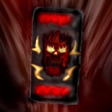


 you might want to add a bit more detail to parts of it. because it looks like a blurry mess. Until then im not quite sure what to say about it.