• 🏆 Texturing Contest #33 is OPEN! Contestants must re-texture a SD unit model found in-game (Warcraft 3 Classic), recreating the unit into a peaceful NPC version. 🔗Click here to enter!
  • It's time for the first HD Modeling Contest of 2024. Join the theme discussion for Hive's HD Modeling Contest #6! Click here to post your idea!

Trial Import

Status
Not open for further replies.

Ralle

Owner
Level 77
Joined
Oct 6, 2004
Messages
10,101
I think it's awesome :D. Anyway, back to the fixes.

EDIT:
My mistake.

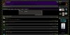
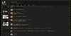
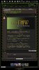
EDIT: Is there anyway you can still make it so that GUI functions still retain their appropriate "icon" in [TRIGGER][/TRIGGER] tags without having to write the "Actions" part above all of it? See here what I'm talking about:

The photo on the left is how the live site parses it (how it should be). The photo on the right is how the beta site parses it.

Both of these have the same exact BB code.
154362d1462122202-trial-import-capture7.png
154363d1462122202-trial-import-capture8.png

As you can tell, the SP Cast isn't lined up with everything else despite both of these having the same exact BB code. That is why I asked if anything changed with [HIDDEN=][/HIDDEN] tags.

Fixed both.
 
Last edited:
Level 37
Joined
Jul 22, 2015
Messages
3,485
Fixed both.
Thank you, Ralle! Here is another "issue" I think I may have found:

Capture.PNG

It seems that text inside a table become centered if you wrap [CENTER][/CENTER] tags outside of the table tags. I believe if you wrap a table with center tags, only the table should be centered. This is the thread in the photo. I brought it up because it seems to be okay in the live site :)
 

deepstrasz

Map Reviewer
Level 69
Joined
Jun 4, 2009
Messages
18,883
About the new site

Checked the beta a little today and I have to write it's quite a difference there. I'm not sure that such a grand aspect change is needed (for instance the map search engine to the right from the left; user interface panels from the right to the left etc.). I think that adjusting this/the current site is a better option since most people are familiarized with it and it is quite amazing the way it is (the looks of the current site are far better; things are much more organized [sections have borderlines and stuff] with the exception of the index headers that are grouped on the new site).
Even the news section is much more presentable in the current site. It has those pointers that when clicked will hide its respective box.
Of course, the new site has a lot of new interesting changes like some for the user profile (by the way, where's the reputation?).

Well, it's just my opinion. What the Hiveworkshop needs is enhancement not total change.

Compare the pictures:
 

Attachments

  • hiveindex1.jpg
    hiveindex1.jpg
    267.2 KB · Views: 126
  • hiveindex2.jpg
    hiveindex2.jpg
    236.5 KB · Views: 80
  • hivemaps1.jpg
    hivemaps1.jpg
    311.4 KB · Views: 90
  • hivemaps2.jpg
    hivemaps2.jpg
    238.3 KB · Views: 57
  • hivemembers1.jpg
    hivemembers1.jpg
    320.8 KB · Views: 55
  • hivemembers2.jpg
    hivemembers2.jpg
    274.3 KB · Views: 81
  • hivenews1.jpg
    hivenews1.jpg
    378.8 KB · Views: 71
  • hivenews2.jpg
    hivenews2.jpg
    318 KB · Views: 67

deepstrasz

Map Reviewer
Level 69
Joined
Jun 4, 2009
Messages
18,883
Checked the beta a little today and I have to write it's quite a difference there. I'm not sure that such a grand aspect change is needed (for instance the map search engine to the right from the left; user interface panels from the right to the left etc.). I think that adjusting this/the current site is a better option since most people are familiarized with it and it is quite amazing the way it is (the looks of the current site are far better; things are much more organized [sections have borderlines and stuff] with the exception of the index headers that are grouped on the new site).
Even the news section is much more presentable in the current site. It has those pointers that when clicked will hide its respective box.
Of course, the new site has a lot of new interesting changes like some for the user profile.

Well, it's just my opinion. What the Hiveworkshop needs is enhancement not total change.

Compare the pictures:
http://www.hiveworkshop.com/forums/2822755-post120.html
For some reason I can't attach the pictures here as well...
 
Last edited:

SpasMaster

Hosted Project: SC
Level 23
Joined
Jan 29, 2010
Messages
1,969
The new site has some new functionalities and features that are really kickass. It performs way better. Some things look way better (like bb code tabs).
On the other hand, I have to agree. I doesn't feel like home. I think I'll have to agree with deepstrasz - maybe it's minor stuff like layout and placement of search bars and other. As I have mentioned in another post the color theme is "colder".

As a mapmaker, I miss certain things (Note: Obviously this isn't the final version, so they may be coming soon, but I don't have anything else to judge on.). I have great difficulty finding my own map in the list, without using the site search. Here, in classic Hive, I have the Top 20 Maps (which not only help me keep an eye on what players seem to like nowadays, but it also gave me a goal to fight for when I was a newb. I wanted to reach the Top 20 maps and that gave me passion to work harder and harder). It's very easy to find Highly Recommended maps or Director's Cut maps at the side. In 2.0, there is a very easy to miss filter at the bottom of the list for DC maps.

When it comes to layout, I think the new site feels alienating for members that have spent years in here and have grown to love the current site. Don't get me wrong - I am ready to accept changes, but with some of the ones I've already seen, it feels like the new site has taken away from the old one instead of building upon it and improving it. I feel like I lost things that I had before, while I think we should have everything we've already had plus some of the new cool functionalities.

I still like the new hive, it just needs a bit more of the old flavor in it. That's my 2 cents on it. :)
 

Ralle

Owner
Level 77
Joined
Oct 6, 2004
Messages
10,101
Thanks for the feedback. We agree that the interface is not well rounded in all places, but it works. We will continue to streamline things and make it more smooth. I am mostly looking for functional bugs and missing features and most important MISSING DATA. I will merge your thread with the trial import.

@TriggerHappy, I am rebuilding the thread search index right now. I hope that will fix it. I think the XenForo import system tells you to do that anyway when you have imported.

EDIT: That did it.
 
Last edited:

deepstrasz

Map Reviewer
Level 69
Joined
Jun 4, 2009
Messages
18,883
I am mostly looking for functional bugs and missing features and most important MISSING DATA.
Missing data takes a huge amount of time to check for. People/users should check for their stuff themselves on the beta site.

Why are there two groups of people, one named Following and the other Followers? What's the purpose of those exactly?
Where's the panel with the users that recently visited my profile?
There's a like system now? Will that just be for the profile or?
Some of my recent posts do not appear in the Postings section of the profile. The same happens in Find all content by "user name". I guess data update is required?
It seems I have no threads. I guess they'll have to be imported as well.
The funny thing is that all links from posts lead to places of the current site :D

A lot of stuff (text, signature etc.) that was centered is not in its rightful place anymore.

I guess you could make buttons look as nice as they are in the current site. The beta has green themed buttons with a variation of green for the text on them.

The Media section hasn't been finished yet, yes?

Search sections like Maps do not have a page number row (1, 2, 3 etc.) below too but only at the top border.

The posting time is shown where the last edited by "user name" on the current site is instead of over the user name in the left on the post header.

Searching for maps will lead to the map name with the avatar of its user instead of the map image.

The moderator's post is not integrated in the map post anymore but is left as the first post of the map thread.

When I click the rating for reviewers and rating of a map a popup message shows saying the same thing: Your rating has been submitted. Well, I don't think the rating counted though.
 
Last edited:

Ralle

Owner
Level 77
Joined
Oct 6, 2004
Messages
10,101
Hey deepstrasz, thanks for posting.
Why are there two groups of people, one named Following and the other Followers? What's the purpose of those exactly?
Follors are the people who get updates when you make a post. Following are the people you subscribe to.
Where's the panel with the users that recently visited my profile?
It's gone, fortunately. I hated it, but wasn't my choice, part of XenForo.
Some of my recent posts do not appear in the Postings section of the profile. The same happens in Find all content by "user name". I guess data update is required?
This import was made on April 28th so that makes sense.
It seems I have no threads. I guess they'll have to be imported as well.
I just addressed this in my previous post.
The funny thing is that all links from the credits in one of my map threads lead to the user profiles of the current site :D
Most links will be ported over when beta.roflmania.com replaces hiveworkshop.com. I have made link rewriters for most things.
A lot of stuff (text, signature etc.) that was centered is not in its rightful place anymore.
Send me the usernames of people where this is the case. BB Code is not 100% the same on both, but they should all more or less work.
 

Ralle

Owner
Level 77
Joined
Oct 6, 2004
Messages
10,101
I guess you could make buttons look as nice as they are in the current site. The beta has green themed buttons with a variation of green for the text on them.
I could, but this new theme is more simple and that's what we're going for.

The Media section hasn't been finished yet, yes?
As I have said in countless places, the user galleries are not imported at this time as it would cut too close with the available space on the server. They will be imported (into the Media section) when the day comes.

Search sections like Maps do not have a page number row (1, 2, 3 etc.) below too but only at the top border.
Oh right. Gonna add that.

The posting time is shown where the last edited by "user name" on the current site is instead of over the user name in the left on the post header.
That is just how XenForo does it.

Searching for maps will lead to the map name with the avatar of its user instead of the map image.
Yes. I do plan to add more information about the actual resource here. It could be much better. It's on my list.

The moderator's post is not integrated in the map post anymore but is left as the first post of the map thread.
That is as designed. We may at some point highlight notable reviews. More on this will roll out later on.

When I click the rating for reviewers and rating of a map a popup message shows saying the same thing: Your rating has been submitted. Well, I don't think the rating counted though.
You are not a reviewer, so that is as designed.

On something completely different. The logic to determine if a campaign was for RoC or TFT has been altered, it was broken before. All new or updated maps will display this information correctly.

EDIT:

Fixed some bb code centering bugs.
 
Last edited:
Level 14
Joined
Jun 3, 2005
Messages
209
I was browsing around the beta site a bit today, and have some feedback. Note that I use some browser plugins that may affect what I see, and am writing according to how I use and am comfortable with using Hive1.

NOTE: None of these are bugs; they are just layout/css tweaks!

Navigation:


  • On the main navigation bar, I feel the most familiar ordering would be: Home, Resources, Pastebin, Chat, (Media,) Forums.
  • I don't know how prominent 'Media' is expected to be, but it's a vague heading. If it encompasses concept art or terrains (which have traditionally been nestled in their respective forums), perhaps rename it to reflect that?
  • The 'Members' listing of a forum is surely not busy enough to warrant a full navbar heading to itself? I use those pages once a year at most.
Navigation (Resources):

  • Navigating to 'Resources' leads to a page that is mostly empty, and simply lists the resource categories. This should be streamlined out. Possible options:
    1. Hovering the arrow beside that heading brings up a helpful 'Quick Links' list. It would be nice if the heading itself was not clickable, and hovering any part of the heading immediately shows that list. (Also, the grey box and text therein would be better css'd out; they inflate space.)
    2. Hovering the 'Resources' header brings up the resource category subheadings on the lower bar (Modes, Icons, Packs...), and users can click one of those.
    3. The resource subheadings are permanently visible from the home page and resource sections of the site.

  • Upon entering a resource section (such as 'Models'), the subheadings under the navigation bar revert from resource categories (Models, Icons, Packs...) to forum subheadings (Mark Forums Read, Search Forums...). That makes it less easy to hop between sections, and shouldn't happen.
Resource Sections:

  • The submissions and sub-standard sub-forums are consuming prime real-estate. I know I would not want to see those by default.
  • The filtered search I use the most is "Your Resources". I'd like that to be a single link I can click (without needing checkboxes or 'Apply Filters').
  • The checkboxes consume a lot of vertical space. It seems like they could comfortably fit into 2 columns?
  • For star ratings, I'd appreciate some indication of the absence of stars. So if a resource is rated 4/5, it would have 4 gold stars and one dark grey 'empty' star. The resource pages have this, but the stars are white (which is confusing: 5 white stars looks like a special rating).
    • Related: hovering a star rating should show '4.2' (the exact rating).
    • Related: a subtle "not enough ratings" text in place of stars for applicable resources.
  • The models section has weird grey boxes with bright green links under the download button for some resources. I don't understand why.
  • I tried to search for one of my own resources using the search bar top-right. It found the result, but had my avatar as the accompanying image instead of the resource's preview. I think it should show the resource preview.
Resource Pages:

  • Keywords should not be in the same text colour/font as the paragraphs describing the resource: that's a bit jarring.
Home Page:

  • I'd make an exception here and not show the breadcrumb bar. It's no use on the home page, and it's right where I'd expect to see the first news item.
Hope some of this is useful, and thanks for all your hard work.
 

Ralle

Owner
Level 77
Joined
Oct 6, 2004
Messages
10,101
Hey SoftMints. Thanks for all the feedback. Many of the things you list I deem a "good enough" for release but I have still added a bunch of them to my to-do list.
SoftMints said:
The models section has weird grey boxes with bright green links under the download button for some resources. I don't understand why.
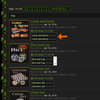
I did not understand this. Can you send me a link and a screenshot where you highlight this?
 
Level 14
Joined
Jun 3, 2005
Messages
209
I think that unit/building models are assumed to have a portrait, and whether that's a separate mdx or not isn't particularly valuable information. Linking each individual mdx file in the resource listing seems to me like it only adds clutter. Maybe other users would disagree.

"Related resources" like alternative skins or a matching icon (that have their own pages) would be nice to know about. All the box needs is a heading, and maybe limit the image sizes to 32x32.

I notice that if I conduct a search for a resource/bundle, I will be brought to the correct url, with "#resource-xxxxx" appended, meaning I arrive part-way down the page. I think in general, I would want to arrive at the top of the page, where the resource's description and preview image are. I don't know exactly how XenForo does things, but it seems like this is because the search is picking up attachments rather than threads.
 
Level 34
Joined
Sep 19, 2011
Messages
2,123
A number of things that i wanted to highlight:

I think it's crucial to sort images before all other files. Check out how this thread looks in old THW and in the new one:
http://beta.roflmania.com/threads/model-giveaway.269688/
http://www.hiveworkshop.com/forums/modeling-animation-276/model-giveaway-269688/

Old system definitely had it's moment here.

Also, i think you guys could stick url to this simple edits resource colletion thread into the models subpage.

When you scroll down to the model page there is no way to switch between pages.

Also i doubt that forum system where last commenter's name is bigger and brighter than threadstarters name is fitting for a resource page.

Cheers!

Edit: it seems i can create packs with other people's resources without asking them and one still can't upload other files into bundles. That would have been so useful if i couuld just upload an archive of models instead of uploading them one by one first.

Edit #2: here i can see icons that i (presumably) deleted. But i can't access them. Weird.
 
Last edited:
Level 34
Joined
Sep 19, 2011
Messages
2,123
I do plan on making a system where you upload a zip and the files are extracted and inserted as model/skin/icon/map.

So whenever i react to a request the resulted model is automaticaly insrted into my profile and into the model section? I doubt it's that much of a good idea, actualy.

I haven't found a way to view my own pending, rejected and etc resources. Is there any at the moment?
 
Level 34
Joined
Sep 19, 2011
Messages
2,123
It would create a single bundle with all your stuff and only if you upload the zip to the resource system.

You go to the pending or rejected section and filter by your name.

Smart!

Oh i see. This is a very good move that too simple resources are not visible in the profile. You know, this way i could intentionaly upload simplier resoucres into that substandard section and i think i am not the only one.

However there is no way one could acess his own deleted resources now, right? I delete my own resources from time to time and i think i'm not the only one here. Maybe they also should be moved into the sunstandart? There is a tonn of non-functioning models already right now.
 
Level 37
Joined
Jul 22, 2015
Messages
3,485
Issues:
  • THE "Proper Unit Group Filtering in GUI" pastebin you and I talked about is still missing.
    Capture0.PNG > Capture1.PNG

  • A lot of my BB code text were deleted over the import. I haven't touched this one specifically in months.
    Capture2.PNG > Capture3.PNG

  • Is there a way to force BB codes to start a new line? In the beta site, it seems they don't consider the enter command as a new line. It was never an issue in the live site.
    Capture4.PNG > Capture5.PNG

  • Using keepspace tags alongside with hidden & trigger tags adds this awkward gap
    Capture6.PNG

Suggestions:
  • Allow users to organize pastebin entries
  • Personally, the show button on hidden tags are insanely fat. They aren't proportional to the size of the text like in the live site
    Capture7.PNG > Capture8.PNG

  • Can otables scale appropriately to what text/images they have versus the entire page?
    Capture9.PNG > Capture10.PNG

  • I think it is kind of pointless to show the "map preview" image of the maps in the Spell Section
 
Level 32
Joined
Apr 2, 2013
Messages
3,954
Some formatting is messed up. Unreadable as you can see from the screenshots.

Other Xenforo forums can automatically shrink images to fit. Maybe that should be implemented.

[center][TABLE][tr][TD][center][IMG]http://www.hiveworkshop.com/forums/members/227608-albums7747-picture108501.png[/IMG][/center][/TD][/tr]

[tr][TD]
[center][b]Introduction[/b][/center]

[url=http://classic.battle.net/war3/ladder/w3xp-clan-profile.aspx?Gateway=Northrend&ClanTag=THW]Clan THW[/url] (Battle.net - Northrend / Europe) is the official WarCraft 3 clan of hiveworkshop.com and
was created on the 12th of December, 2015. It's an all map-genre clan and is open to veteran and new
members alike. It doesn't take modding or multiplayer skill qualifications to get invited, so you can
just pop right in by typing in /j Clan THW in any Northrend channel!

[/TD][/tr]

[tr][TD]
[center][b]More Information[/b][/center]

Every few weeks, we play in the [url=http://www.hiveworkshop.com/forums/multiplayer-clans-arrangements-726/funmap-evening-event-233026/]Funmap Evening Event[/url]. Also make sure to keep an eye out on other
events in [url=http://www.hiveworkshop.com/forums/multiplayer-clans-arrangements-726/]this[/url] forum and or our social media. Anyone can post threads with the [Clan THW] prefix there
about clan vs clan matches, map testing sessions, or just questions about the clan, though you can
post questions and comments on this thread.

Hive has also set up a free [url=https://discordapp.com/channels/178569180625240064/178569180625240064]discord for voice chatting[/url]! This is a neat tool to chat with other Hive and
Clan members, especially during events and team games. No download is needed, but it can be
downloaded on all the major platforms.

Future events include more and different events, along with adding a secondary "Clan Hive"
if almost all of Clan THW is active and full.[/TD][/tr]

[tr][TD][center][b]Clan Rules[/b][/center]

- [url=http://www.hiveworkshop.com/forums/rules-information-710/site-rules-245478/]Site Rules[/url] that can easily apply to the clan channel are enforced due to the clan being official
- Members 100 or more days inactive will be kicked, but may be accepted into the clan again

These rules are enforced on a much more casual and tolerant level. Members will usually only be
kicked (excluding voluntary and inactivity reasons) for breaking major rules (such as severe and
ongoing flaming). Those banned from the site will be ones banned from the clan. If you think someone
is severely breaking the rules, you can report it by using the site report function or by creating a [url=http://www.hiveworkshop.com/forums/staff-contact-692/]staff
contact[/url] thread.

[/TD][/tr][/TABLE][/center]
 

Attachments

  • Screenshot_2016-05-12-23-09-16.jpg
    Screenshot_2016-05-12-23-09-16.jpg
    172.5 KB · Views: 87
  • Screenshot_2016-05-12-23-15-09.jpg
    Screenshot_2016-05-12-23-15-09.jpg
    291.9 KB · Views: 67
Status
Not open for further replies.
Top