• 🏆 Texturing Contest #33 is OPEN! Contestants must re-texture a SD unit model found in-game (Warcraft 3 Classic), recreating the unit into a peaceful NPC version. 🔗Click here to enter!
  • It's time for the first HD Modeling Contest of 2024. Join the theme discussion for Hive's HD Modeling Contest #6! Click here to post your idea!

Terraining Mini-Challenge: Minimalism

Status
Not open for further replies.
Level 24
Joined
May 15, 2013
Messages
3,782
My last submission

And heres the link to the WIPs
Link
 

Attachments

  • DesertlyMigration.jpg
    DesertlyMigration.jpg
    130.1 KB · Views: 134
Level 20
Joined
Apr 14, 2012
Messages
2,901
Okay I'm joining. Haven't been here in a while.
Oh crap I only have 4 days left OH MY GOD


Edit. I'm using no imports for this one.

Edit 2:
WiP:
[hidden="See the WiP?]
VMJ8Gb7.jpg

[/hidden]

Okay, attached the final entry.
I call it, To Run, or Not To Run.

:grin:
 

Attachments

  • To Run or Not To Run.png
    To Run or Not To Run.png
    1.4 MB · Views: 108
Last edited:
Wooah that is cool! It looks like a black hole!

Predictions:
As the terrain progresses, the black hole will consume all of the camera's view, leaving only the eternal and cold darkness that is the void of the black hole itself.

Lol xD
Actually, that's not a black hole, it's a planet. Planning to do some solar eclipse kind of stuff.

EDIT: Here's WiP2, next one will probably be final. Need to add some fog and asteroids and stuff :p

EDIT2: I just realized how dumb I am. I was planning to make some asteroids close to the camera, which means the camera is in space. If the camera is in space, the light from the sun should not be yellow, it should be white :S
Meh, I'll work it out I guess...
 

Attachments

  • WiP2.PNG
    WiP2.PNG
    753.5 KB · Views: 117
Last edited:
Level 20
Joined
Apr 14, 2012
Messages
2,901
Lol xD
Actually, that's not a black hole, it's a planet. Planning to do some solar eclipse kind of stuff.

EDIT: Here's WiP2, next one will probably be final. Need to add some fog and asteroids and stuff :p

EDIT2: I just realized how dumb I am. I was planning to make some asteroids close to the camera, which means the camera is in space. If the camera is in space, the light from the sun should not be yellow, it should be white :S
Meh, I'll work it out I guess...


Ooohh now it makes sense HAHAHA
Good luck bro, 3 days to go xD
 
[Final] - Solar Eclipse by Blood Raven

Got any suggestions guys? If not, this may be my final. :]

EDIT: This is my final. I attached a wider resolution image, but it's also lower resolution. I might fix the resolution issue later... perhaps.
EDIT2: Added a higher-resolution screenshot by Heinvers (thanks dude!)

144558d1428325389-terraining-mini-challenge-minimalism-solar-eclipse-final.png
 

Attachments

  • Solar Eclipse Final.png
    Solar Eclipse Final.png
    2.7 MB · Views: 219
Last edited:
Level 20
Joined
Apr 14, 2012
Messages
2,901
Got any suggestions guys? If not, this may be my final. :]

EDIT: This is my final. I attached a wider resolution image, but it's also lower resolution. I might fix the resolution issue later... perhaps.


Ohh duudee I think it would be cooler if the asteroid belt crossed the path of the planet; like instead of it below the planet, it would be like in the middle (like Saturn's rings) or tilted at an angle xD
 
Ohh duudee I think it would be cooler if the asteroid belt crossed the path of the planet; like instead of it below the planet, it would be like in the middle (like Saturn's rings) or tilted at an angle xD

Hmm tilting it would be quite the pain in the ass :D
Although it in fact IS in the middle, it doesn't look like it is, I might raise it a little bit.
Also I might tint them a little, they look too bright

EDIT: hmm, that the asteroid ring isn't tilted doesn't mean the camera isn't. [/lazy excuse] :D
 
Level 20
Joined
Apr 14, 2012
Messages
2,901
Hmm tilting it would be quite the pain in the ass :D
Although it in fact IS in the middle, it doesn't look like it is, I might raise it a little bit.
Also I might tint them a little, they look too bright

EDIT: hmm, that the asteroid ring isn't tilted doesn't mean the camera isn't. [/lazy excuse] :D

Oh I see. Okay. Tinting them would actually look better though hahaha

Hey man when you finish, can I have a 1366x768 picture of that? I'd like to have a wallpaper of it D
 
Oh I see. Okay. Tinting them would actually look better though hahaha

Hey man when you finish, can I have a 1366x768 picture of that? I'd like to have a wallpaper of it D

Well, if you could make a screenshot 1366x768 I would gladly provide you the map :p

EDIT: Here is a 1722x998 awesome screenshot provided by Heinvers. Thanks dude, you are awesome! I'll also upload it in my [Final] post.

EDIT2: Moved the attached image to the final post.
 
Last edited:
Level 34
Joined
Sep 6, 2006
Messages
8,873
I have been doing my apprenticeship which means 4 weeks of intense study. I am done Thursday. Can we get an extension until Monday to finish over the long weekend?
 
Level 2
Joined
Mar 26, 2015
Messages
8
Hallo

I'm fresh in on this forum - recently joined.


Terrain contests are judged by judge/judges looking at a) screenshots of maps or b) files of maps...
Yeah, that's kindof putting what I need confirmation of out there.


-=sidenote: I volunter as a judge, PM me for contact info if wanted (seeing I'm new to this forum you'd want to be certain of me, I presume)=-

Pictures (Screenshots. Basically you need to do a map, take a screenshot and post it here.
 
Level 34
Joined
Sep 6, 2006
Messages
8,873
Hallo

I'm fresh in on this forum - recently joined.


Terrain contests are judged by judge/judges looking at a) screenshots of maps or b) files of maps...
Yeah, that's kindof putting what I need confirmation of out there.


-=sidenote: I volunter as a judge, PM me for contact info if wanted (seeing I'm new to this forum you'd want to be certain of me, I presume)=-
Yeahhhh, you're going to have to spend some time here before being accepted to judge. Besides, Keiji is doing it I think, and that's enough.
 
Level 36
Joined
Nov 24, 2007
Messages
4,382
Well, I kind of actually DID state in the main post that I'm looking for a co-judge,
but mostly what Gilles said, I don't know if I trust someone who recently joined
and who apparently doesn't know much about terrain art.

This is a "terrain art" contest, meaning we're looking at the screenshot and not the
map. The practice of "terrain art" is kind of weirdly a mixture of art, photography
and map modding all at once.
 
Level 36
Joined
Nov 24, 2007
Messages
4,382
Here's the scores, and some text to fill the numbers. I didn't spend two
hours writing these reviews, and every time I do this I remember why I
hate judging contests, and still I keep on doing it, I feel like a shitty sadist.
So, although they aren't grand and very coversome, which I move should
be a word, they are at least some bits of my thoughts.

Have fun, if you have any further questions, or want me to elaborate on
something in the review, come forth.

Blood Raven

7.3/10

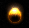
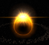
Rarely do I see a space terrain done well, but this one is pretty neat. I love the lightwork, although a little too fiery, and I can’t really shake off the feeling that it does look a little… Incomplete. Still, it’s meant to be a sun, so I’m letting you a little off the hook for the vibrant yellowness. I’d still love to have seen a little more colour-mixing, maybe just to make it a little more artsy. But overall, with the space-clouds and the sun-flare, it looks decent, even if the flare is somewhat off to my eyes, I think it should have been closer to the actual sun.
For a minimalistic theme, it’s cool. But the planet doesn’t sit well with me, I just don’t understand why you made it oval, it should have been spherical, like the flare, and it especially looks off being beside the flare, which is spherical. The meteor-belt is alright, but I don’t think it neither adds or takes from the overall impression, you might have made it a little more impressive, maybe by expanding it and making it “flatter”, like you see the rings of Saturn.

DeathChef

5.2/10

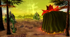
I love the spell-thing, the way it expands a darkening pool like some mist of death on the neatly tricked ground, which is a nice effect too. But I can’t for the life of me understand some of the doodad choices, as well as the banshee. The green rocks looks ridiculously out of place, and look far too cartoony and stretched, the trees just doesn’t make sense to me and the water simply looks bland, especially being such a close colour to the ground. I also don’t see why you’d choose to go with some really dark rocks and some bright ones, you should’ve stuck to either of the two, I’d prefer the dark ones, but I think you could have generally found better rock doodads for this terrain, maybe the Sc2 exports in Toby’s map? >.>

Edge45

5.0/10

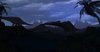
When I first saw you start this terrain, I hoped it would look great, I liked the idea, and I hoped you’d be able to pull it off. The way it stands, however, leaves me thinking it’s either too dark, or not bright enough. To me it seems you couldn’t decide, personally I think you should have gone darker, and have used the “Light” doodad and fog to make some sort of light-source, maybe even a moon slightly brightening certain parts of the terrain. The background and sky are bland, they don’t transition smoothly, and although in a silhouette terrain it’s all about the contrast, as I said, you just made it too bright for the contrasts to work properly. With the current light-setting the dinosaurs also look out of place, they look stiff, mechanical, like they’re not real animals and just some poor rubber figures at a half-assed dinosaur exhibition. I like the palms, though, reminds me a little of one of my own terrains ;)

Fladdermasken

7.8/10

I rarely admit that I find units fitting a terrain, and I often strive make people believe that I truly hate it, however much of a hypocrite I am about it, but I’m going to admit it, that samurai-dude(tte) fits this terrain nicely, and it likely wouldn’t have been the same without him. But I don’t think it comes as a surprise to you that I don’t appreciate the… Whizzy fairy effects. I can see why you did it, and honestly, I can see that the terrain would seem awfully hollow without them, but I think you could have done something different to give the terrain flavour. I just find the waves too… Obtrusive.
The Sin City effect is a pretty cool trick, though, I just think you could have done it differently, like, I’m not sure. With some red blood splatter on the ground, or maybe some big-ass monster in the mists, slightly illuminated my coloured glowing eyes. Something like that. Other than that, the terrain is pretty decent, there’s nothing else that seems out of place to me, and the overall impression is satisfactory. Not your best effort, but then, not every terrain can be a Mona Lisa.

Gilles

NR/10 (No Rating)

Gilles. Why didn’t you finish? I was so stoked when I saw you enter, and I absolutely love the beginning of this terrain, I think you could’ve made it into something really nice. As you can see, I gave no rating, because I don’t think there’s much to rate here, it’s white, there’s a mountain and a pier. It’s minimalistic like hell, and granted a little artsy, but I don’t think it’s the finished product, and I don’t find it a finished product. Please finish it, regardless of the contest.

Heinvers

6.0/10

Nice smooth fog, boring sky, too rounded hills and I don’t know what’s going on with that… Person. Let’s not fool ourselves, this doesn’t fit the frame of the contest. It’s a pretty decent terrain, nothing much to nit-pick, really, except that it lacks vision, and that there’s hardly anything to the terrain. It somehow reminds me a lot of the old days, it has that old-school kind of vibe to it, and for that you score a couple extra points, but yeah. As I said, it doesn’t really seem like you gave it your all.
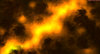
Kino

8.0/10

I honestly don’t understand why I love this terrain, I don’t even know if I can call it a “terrain”. And maybe that is exactly the reason why I like it so much, because it’s bizarre, it’s curious, and it looks completely bloody badass. Essentially, it’s just a jumble of smoke and fire, or lava, to my eyes seen from above, like some sort of fiery river in a burning landscape, but there’s something really artistic about it. And it certainly fits the profile for minimalism. I even like the birds, the small pixelated things in the middle. I’d love to have a look at it in the editor, if you wouldn’t mind sharing :)

~Void~

7.9/10

Like Kino, Void, you hit the nail of the soul of this contest, minimalism. Even if yours is a little over at the abstract side of things, as well, but then I’d say the two, while not going hand-in-hand, I imagine they stroll shoulder-to-shoulder, at a minimum. Heh. I love the way the “constructions” starts in blackness down in the bottom left corner, and fades into whiteness at the top, giving off the creepy notion that there is a white fog surrounding this place, like clouds or something. If anything, the only things I find a little bothering is the things surrounding the dining area, the chairs looks a little too vertically stretched and it’d looked better if the cloth on the table was circular, not rectangular. Not to mention, those wine-glasses, they just don’t fit, everything else is either black, white or a striking colour, they are transparent and give off just a tad too many shades of different colours for my taste. But hey, they’re such a small part of the terrain that I won’t bicker for much longer, just a little: remove them.

War3Citizen

2.0/10

Next time, place a camera in the editor and work from that angle and THAT ANGLE ONLY. I don’t honestly know which of the three you wanted me to look at but I chose (this). You need practice, my friend. I advice, if you want to become a better terrainer, that you go read up on tutorials, but Iæll give some direction:
For the shot I linked, I’d raise the camera so only a little of the ground was visible, for a terrain like this I’d have gone for a silhouette look and feel. I’d have lowered the mountain range, smoothed it out, changed the fog from the current completely out of place turquoise to black. Then I’d added a sun peeking over the horizon, added a lot of glows to light up the horizon, tinted all the doodads black, or used the Boundary brush in the Terrain Palette to make everything black, then I’d used the light doodad behind the wolves just to give them a little colour around the edges. I would have probably tried to find some good looking grass doodads and added them to the ground just to make it seem less… Flattened.


Kino
 
Level 36
Joined
Nov 24, 2007
Messages
4,382
90 minutes! I wasn't able to hold you all for fools any longer?
What a disappointment, here comes the rest.

Kristopher

5.3/10

You seem to have been taking the term “end of the world” to a whole new level, mate. And I kind of like it. The same can’t really be said about the rest of the terrain, though. The woman doesn’t fit, at all. For one, she doesn’t blend with the fog, and for two, she doesn’t blend with the fog. The playground theme is a nice idea, only I find the execution a little lacking. I get that they were scaled to fit with the unit, but then, they still look monstrously large, disproportionately large, actually. I also think the white fog could have done with a little more distance stuff, like those trees in the background, I’d like to see a small hill or something sticking out of the fog, just to give it some more depth. Other than that I also find the overall flatness a little too flat, you should have added some more elevation to the terrain. It’s decent, but there’s much to desire as well.

MasterTrainer

2.5/10

This one’s marginally better than War3Citizen’s terrain, but only because it has a little more details to it. The sky is a horrible choice, never use that sky ever again. The fog is unnatural, and the ground seems to be covered in with the noise brush, which should pointedly NEVER be used in terrain art. It just makes the terrain floor, or ground, look… Like the top of an oversized sandpaper. And this terrain is a classic example of “units done wrong”, the standard wc3 units should ONLY be used in terrains by experienced terrainers who know how to stretch and twist them, or hide them, well enough to fit the terrain. Oh, and, the palms and cacti, just… Don’t ever throw them in my eyes again.

Nknight001

7.9/10

Knight, my friend, you are a pretty great terrainer, and I think you should seriously consider getting into terrain art. This terrain is a piece of art, and it could, with some minor tweaks, have won the entire thing. I love absolutely everything about it, except those wc3 rocks. They don’t REALLY look that bad, it’s just knowing what they are that makes my stomach twitch when I see them. But other than that, this is a nice terrain. I love the atmosphere, I love those glowy balls, and I’m curious as to how you made them look so… Magical. The background tree is a pretty neat idea, but it could have been executed a little better, and by that I mean, it could have looked a little more NATURAL. With better transitions between the branches and a little more of the odd branch sticking in a random direction, as is now, it looks constructed. The figure in front of the tree is a classic example of “unit use done right.” Ta, mate, you actually nearly had this one.
 
Status
Not open for further replies.
Top